Choosing a route
“What's the difference between fast and easy?”
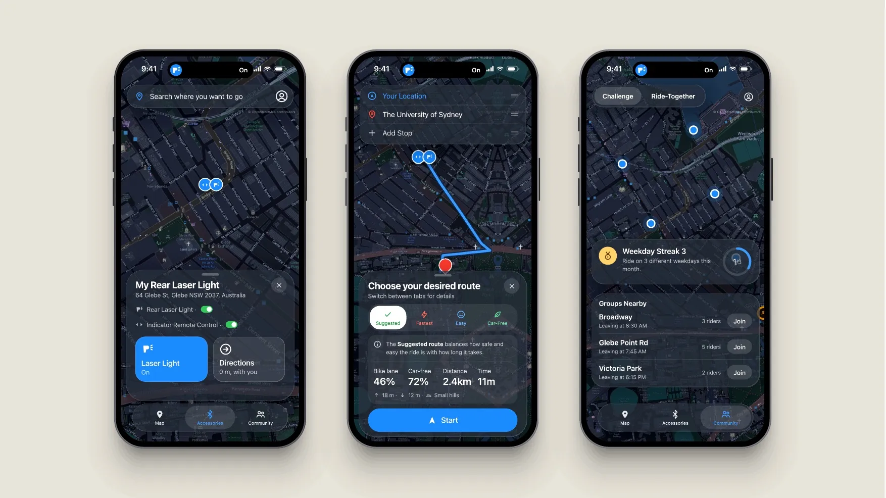
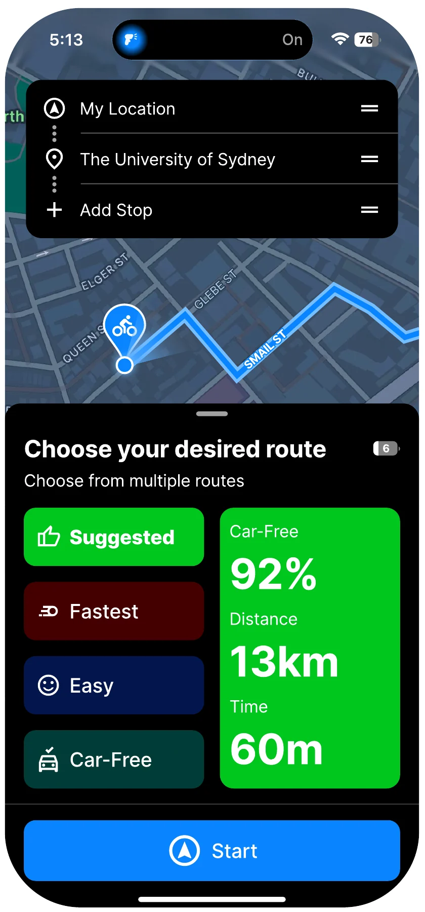
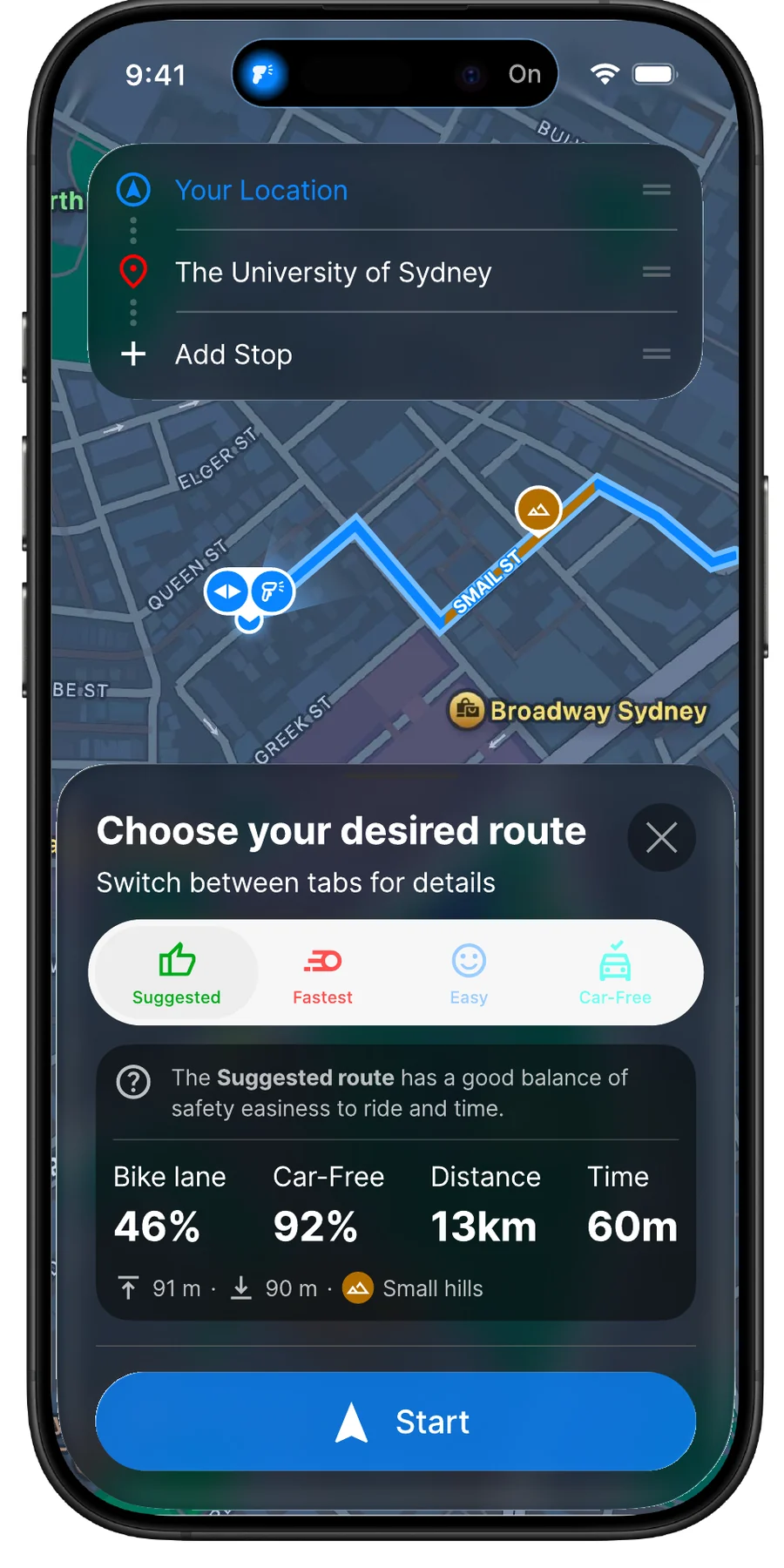
Four coloured buttons became a tab bar, with a line explaining each route and four numbers: bike lane share, car-free share, distance and time, with elevation underneath.
Everything here applies to the whole site and is remembered on this device.
Design, for me, is working out what someone is trying to do and then getting out of their way.
I start with the people who will use something. I talk to them, watch what they do, and let that decide what gets made.
From there I move quickly between research, prototyping and testing: make something rough early, put it in front of people, and change it based on what happens.
That has taken me across apps, physical products, spaces and services, always paying attention to the small details that make something feel easy.
Outside design I'm usually near the water, planning the next trip, watching whatever sport is on, or having a beer with mates.
Project 01 / 06
Interaction design · University project
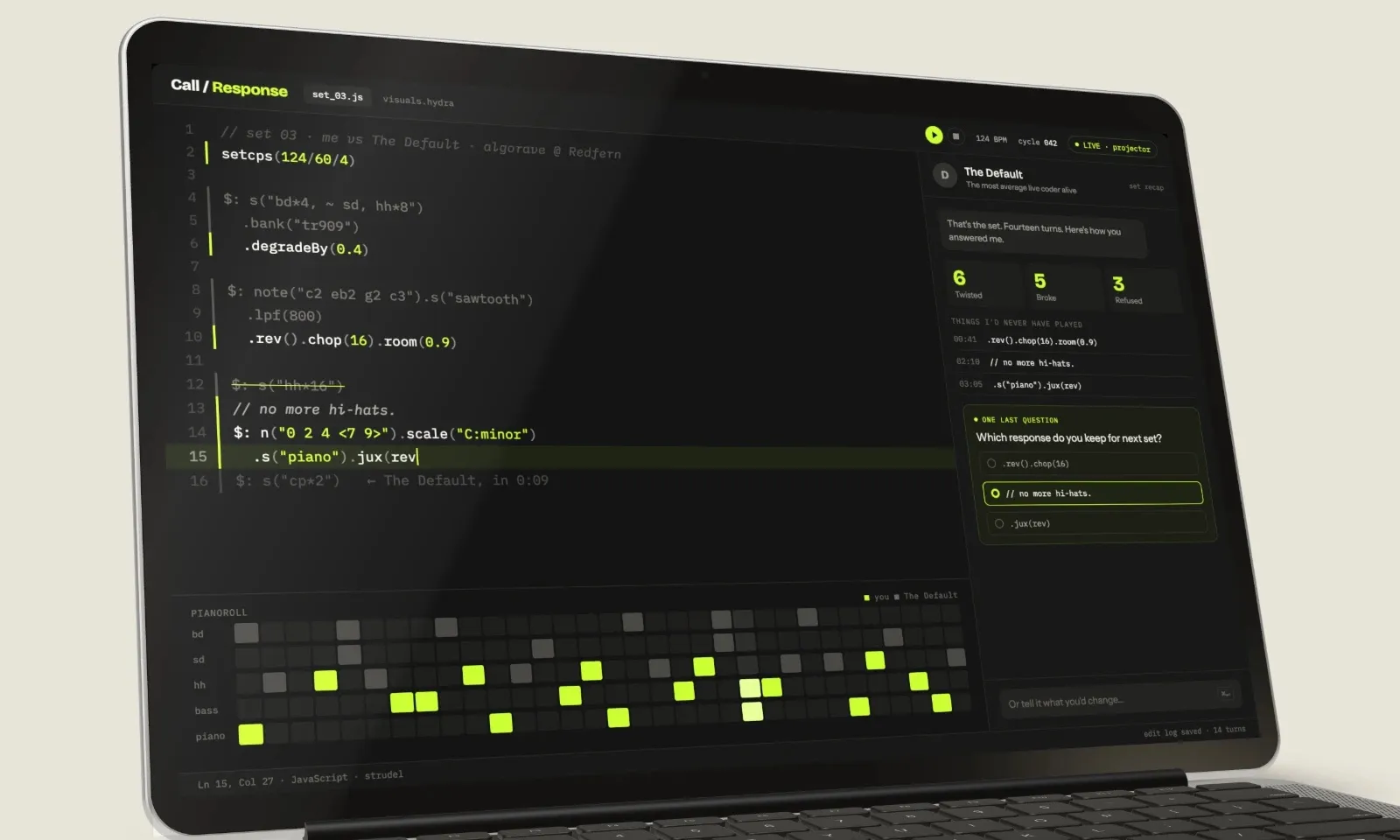
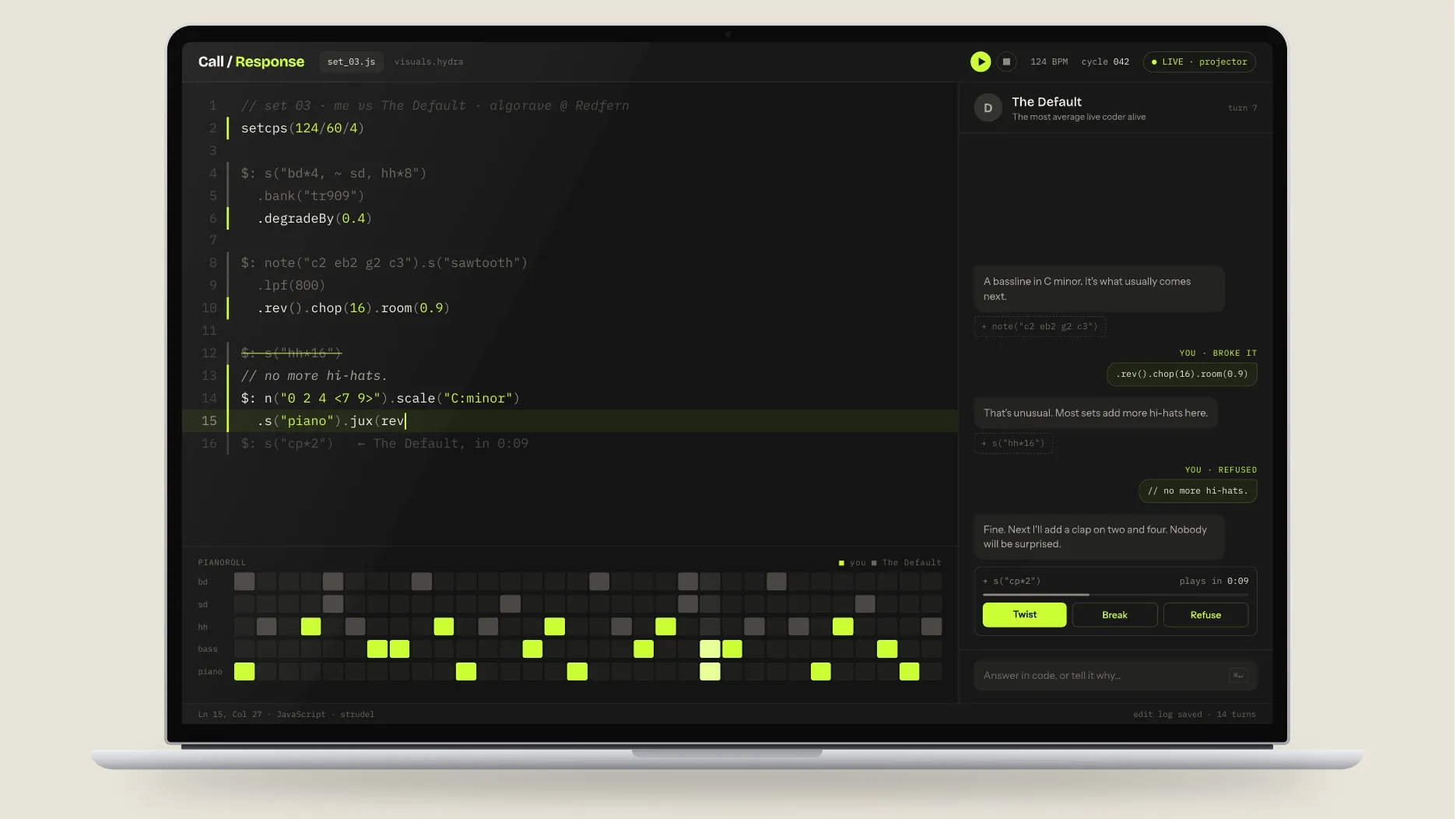
An AI bandmate and critic that teaches beginners to code through live music. It plays the most obvious move, the student answers it, and the critic asks why.
Coding has never been my strongest skill, and AI can now finish a beginner's assignment in about ten seconds. If it can, how would anyone know the student learned anything?
Beginners can paste, but they can't really code with AI, because none of their thinking shows. That's what I set out to design for.
How might we teach first-year Design students to code with AI, and assess it in a way AI can't fake?
Algoraves: dance nights where the music is made live with code and the performer's screen is projected for everyone to see.
There's no hidden laptop. The performers write code on stage and the crowd watches every decision as it's typed, so the thinking is part of the show. The scene's unwritten rule is “show us your screens”.
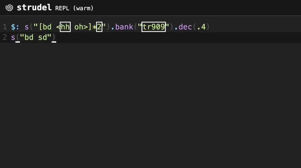
That was what coding assessment was missing: a place where the thinking can't be hidden. I tried it myself in Strudel, a free live-coding tool that runs in the browser, so I'd be pitching something I'd used.
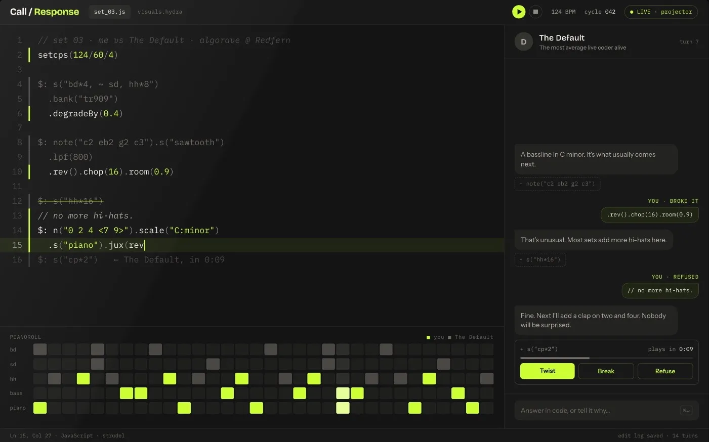
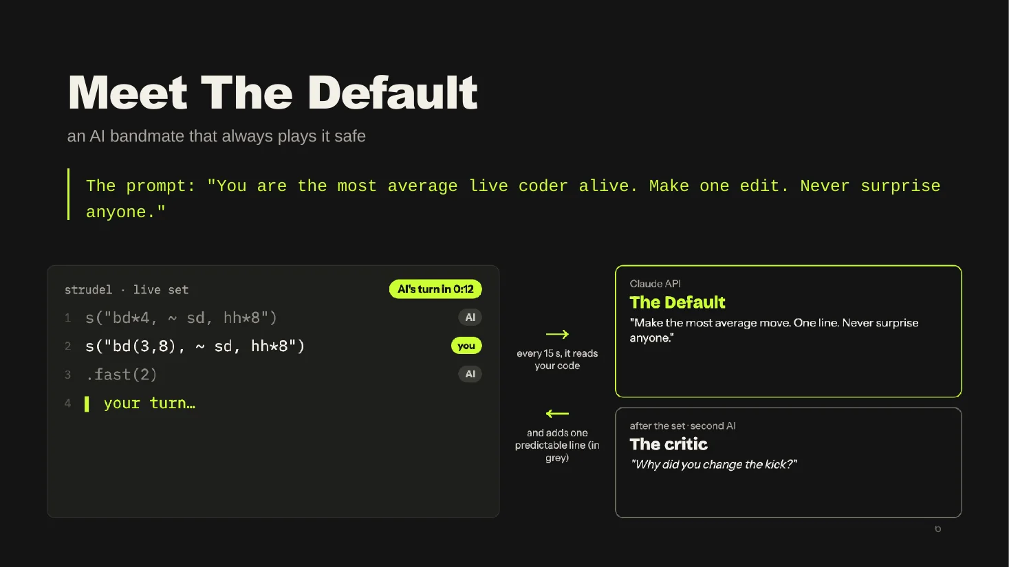
The Default is a bandmate that sits inside the code editor and takes turns with the student.
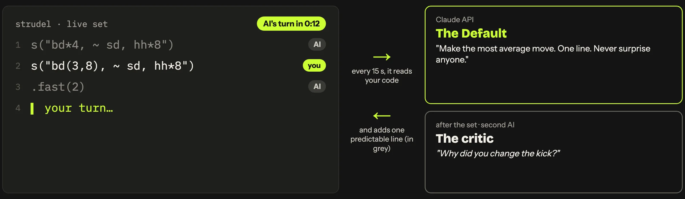
About every 15 seconds it reads the student's code and adds one line: a standard beat, a build-up, a drop. Its lines show in grey.
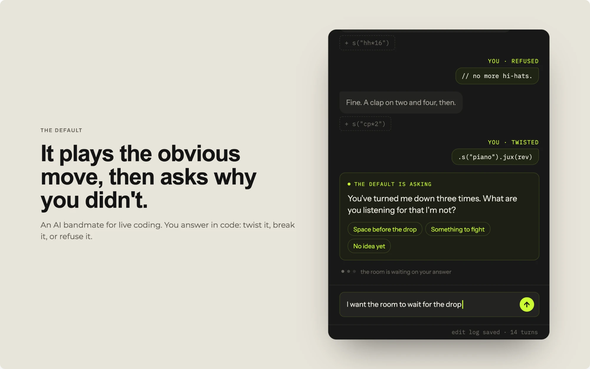
They twist, break or refuse what the AI just did. Anyone watching can see who made each choice.
After each set, a second AI reads the log of who wrote every line and asks about the student's choices. It never asks how, only why.
“You are the most average live coder alive. Make one edit. Never surprise anyone.”The Default's whole prompt
Boring on purpose: language models drift towards the average anyway, so I made that the lesson. Students learn to spot the obvious move and choose something else. The student's answers to the critic become their written reflection, which is the part AI can't do for them.
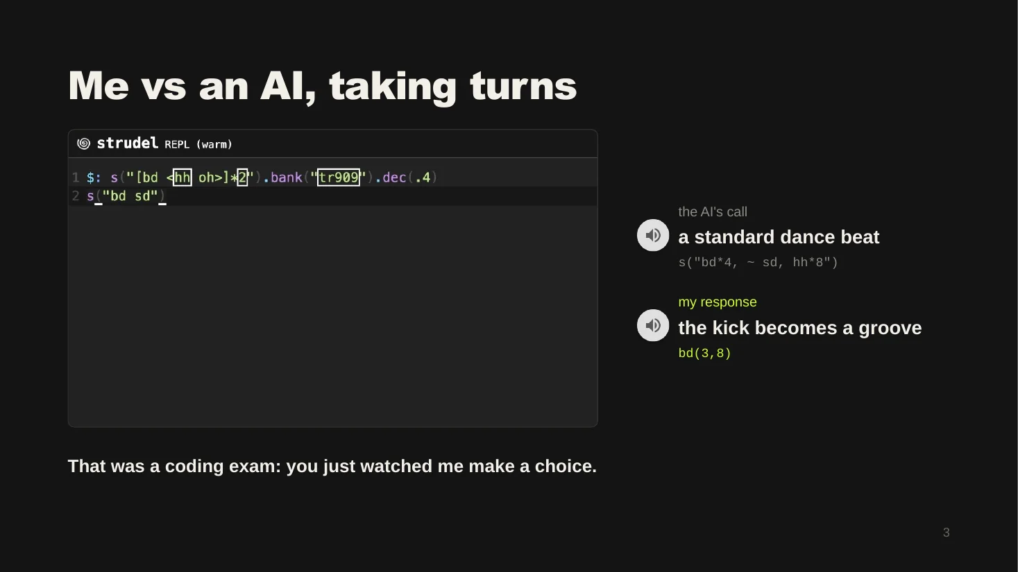
The Default makes the call and the student makes the response. These are the two clips I played live in the pitch.
s("bd*4, ~ sd, hh*8")s("bd(3,8), ~ sd, hh*8")I changed one thing. Four even kicks became three hits spread over eight steps. Same beat, but now it grooves.
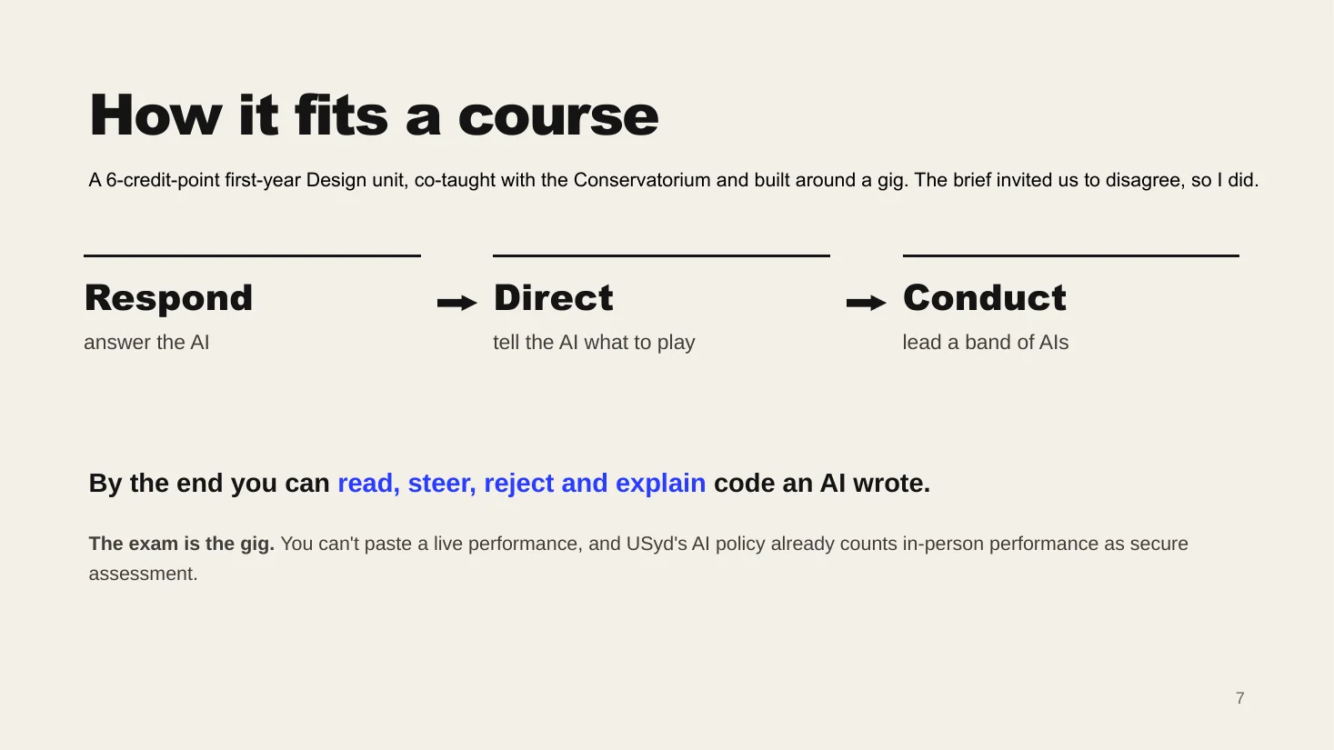
A first-year Design unit, co-taught with the Sydney Conservatorium of Music and built around a final gig.
A web page built with HTML, CSS and JavaScript. Strudel plays the music, Hydra does the live visuals, and Claude runs The Default and the critic.
The riskiest part is the AI writing a line that breaks the music, so every line would be tested before it plays, with a safe backup ready. For a first prototype I'd use Wizard-of-Oz, where a person secretly plays the AI, so I can test the teaching before building the AI.
I also thought about who it could hurt. The AI is never the artist, every sound is Creative Commons, nervous performers can work in small groups or record a set, and talent isn't marked, choices are.
I used Claude while developing the concept, doing the research and drafting the slides.
In the concept itself, The Default and the critic would run on Claude too, so a fair bit of this project was working out where an AI should take a turn and where it shouldn't.
I started as someone who finds coding hard and designed around that instead of hiding it. The biggest shift was seeing that AI's pull towards the average doesn't have to be a weakness. It can be the lesson. Next I want to build a Wizard-of-Oz version and try it with real students.
Project 04 / 06
Design research · Concept video · University project
A theoretical design study of how people shape their runs for an audience on Strava, built on one idea: a run gets finished twice, once on the watch and again when it's edited. We presented it as a three-minute concept video that we designed ourselves, with two teammates.
The finished video thesis, 3:00. Captions are burned in.
Strava is where a lot of people share their runs and rides. The numbers on a post come from the app: distance, pace, time and the map. The title is written by the runner, and so is the choice of who gets to see it.
We started from one question. When people decide what a run says about their fitness, does that change with their age and with how long they've been running? That second part, age versus experience, is where the whole project ended up.
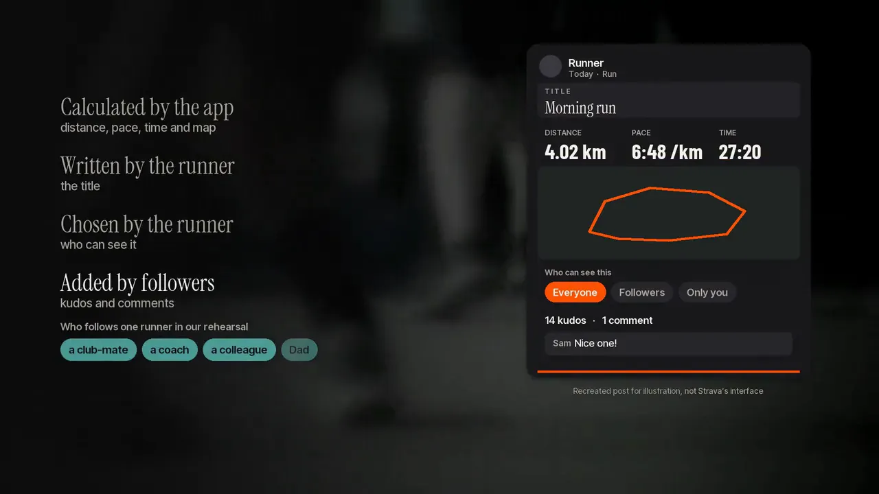
From the video. The app calculates the numbers. The runner writes the title and picks who sees it. Followers add the reactions.
The study is a research proposal, and the video is how we present it. For ARIN3620 we had to make a three-minute video thesis, which is a research proposal told on screen, so we designed the video as a piece of work in its own right. We picked a template called Balanced Four-Part, because no single part of our argument could carry it alone.
One line runs through the whole video: a run is finished twice. We open on a runner deleting an excuse for four slow kilometres, so you see the habit before we name the idea. Then we rebuild a post on screen to show how a platform shapes what people are prompted to show (Gillespie, 2010). A map puts our proposed interviews in Sydney and regional NSW, and stock footage stands in for the settings.
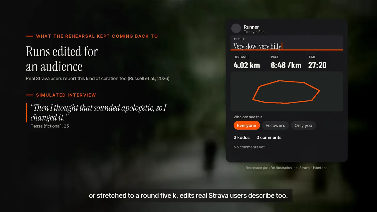
The post we rebuilt on screen. Watching the title get retyped is the point.
We couldn't interview real people for this assignment, so we rehearsed. With our tutor's permission, we generated sixteen interview transcripts with ChatGPT and used them to test our interview guide.
Piloting is a normal step in designing interviews (Kallio et al., 2016), and it let us fix sensitive questions before we'd ever ask a real participant (National Health and Medical Research Council et al., 2025).
The catch is that language models can flatten different groups of people (Wang et al., 2025), so these transcripts can't tell us what older or younger Strava users really think. They could only show us where our guide was weak. That's why the video presents what came out as ideas to test, with no counts, and says so.
Two things changed because of the rehearsal. We decided to recruit across how long people have been in the sport, and we added questions about who follows you and whether anyone has ever commented on your age.
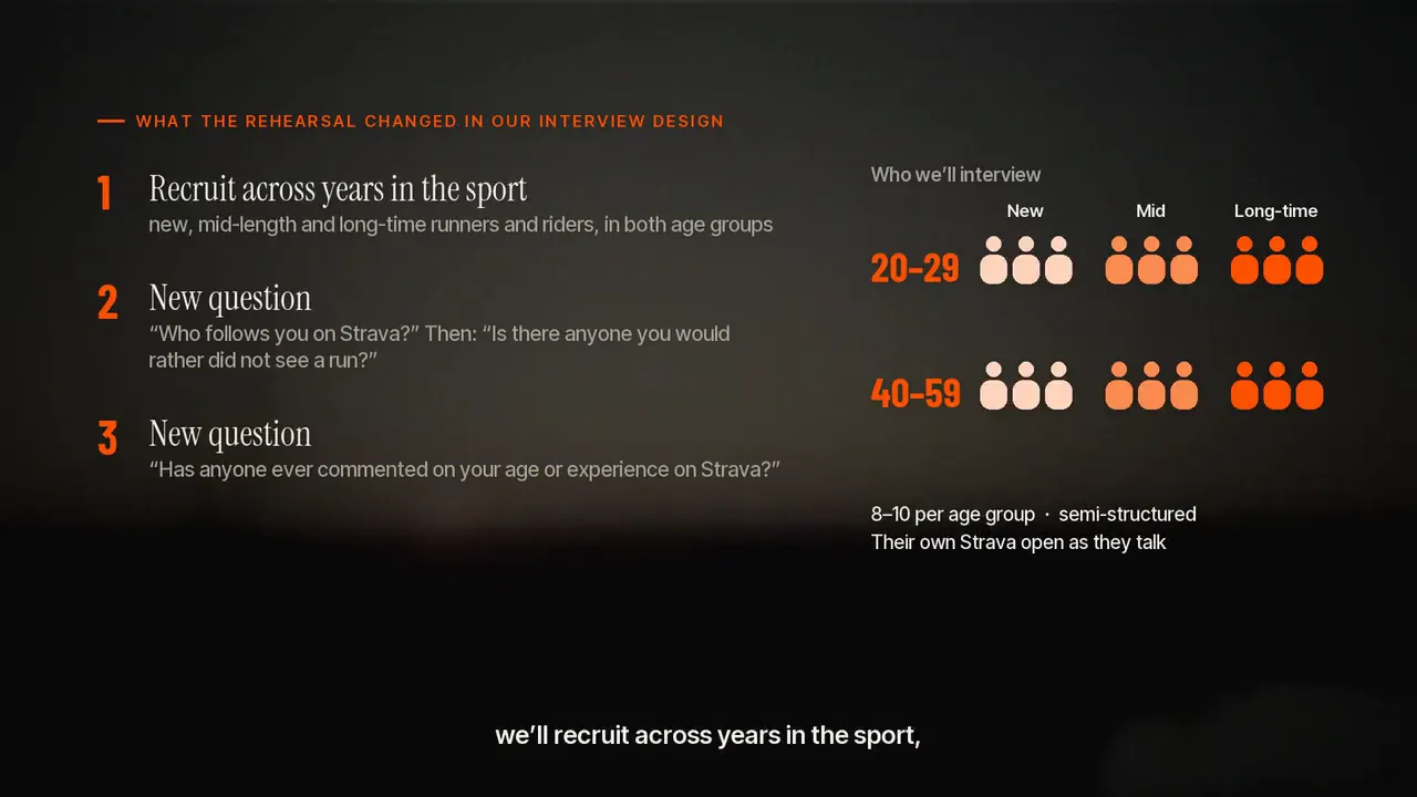
What the rehearsal changed in the interview design.
Past research compares new and experienced users (Stragier et al., 2016) and looks at how apps measure ageing (Marshall & Katz, 2016). We couldn't find a study that separates age from sporting experience.
So we made that gap into a puzzle. In the rehearsal we had two simulated runners, one 21 and one 43, who were both two years into running, and they gave almost the same answers. In the video we ask the viewer to guess which is which. It turns the research question into something you can try, an approach from Alvesson and Sandberg (2011).
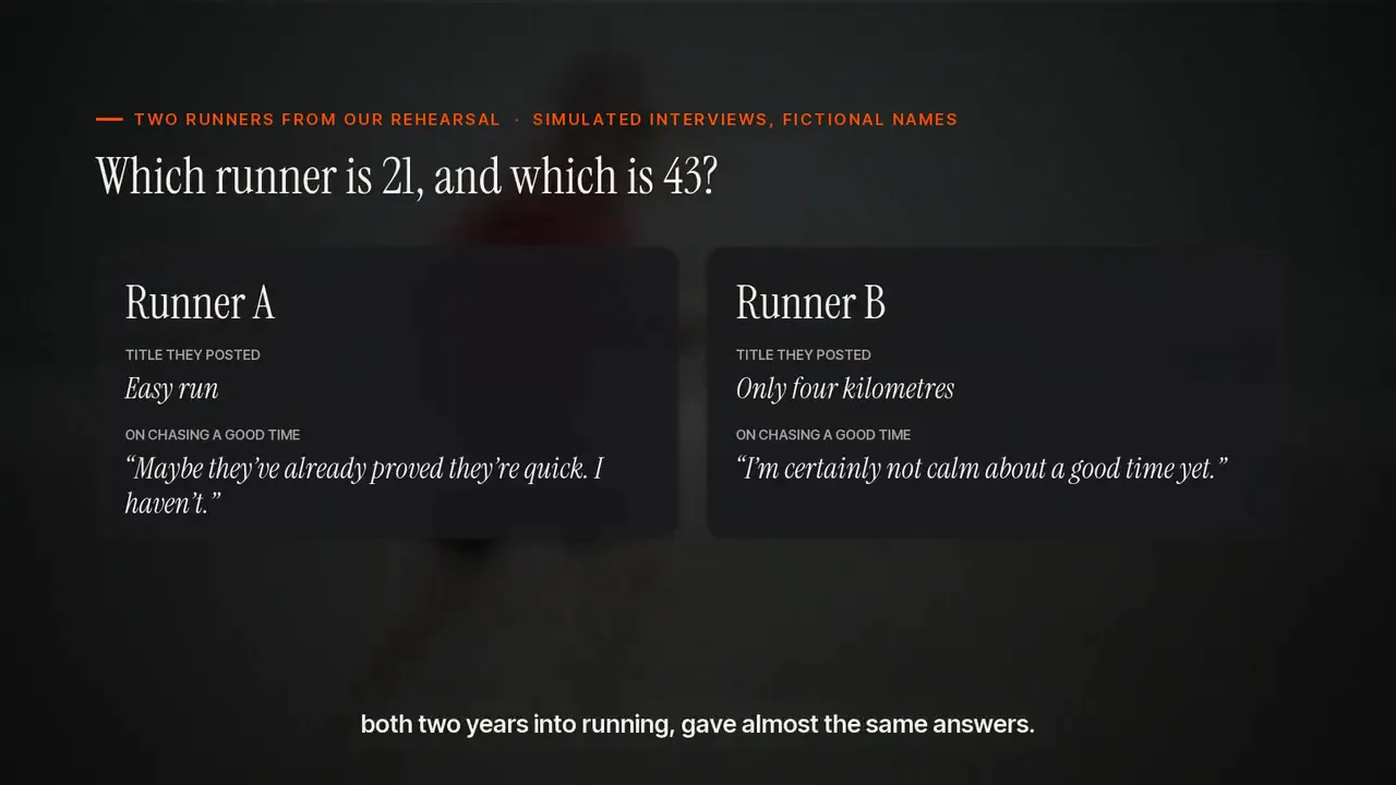
Which runner is 21, and which is 43?
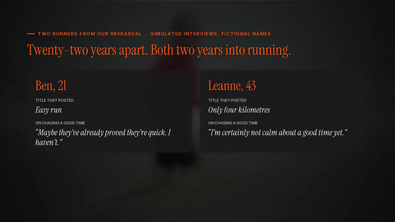
The reveal. Twenty-two years apart, both two years into running.
For researchers, the question is whether missing runs follow a pattern. People curate their profiles for their most critical viewer (Hogan, 2010), and Strava data is often read as plain behaviour (Lee & Sener, 2021).
For planners, it's about Strava Metro, which leaves out activities set to private (Strava, 2026). If the slower trips are the ones people hide, a planner could end up looking at a fitter city than the real one. We can't say that's true yet. It needs real research, which is what the proposal is for.
Fitting this into three minutes meant dropping things. Once age got hard to tell apart from experience, the question that survived was who a run is for.
We also ran out of room for gender, which matters a lot for who counts as fit on Strava (Barrie et al., 2019). And an earlier cut showed the rehearsal patterns as findings, with counts. At the pace of a video they sounded more certain than they should, so we rewrote them as propositions.
All three of us agreed the themes and approved the final video.
ChatGPT generated the simulated interviews, with our tutor's permission. Claude helped with analysis, scripting, graphics, editing and drafting the exegesis, under our direction.
Both are written up in the appendix of our submission. The transcripts only point at weak spots in our guide and at ideas to test, and the video says so.
Project 02 / 06
Service design · Spatial design · UX design · University project
A private booth in a venue where you can stop for a couple of minutes and check in with yourself, built for people who would never walk up to a staff member and ask for help.
The brief was to design something that supports self-regulation and looking out for each other in loud, high-energy nightlife settings. Making help easier to ask for is the obvious answer. The trouble is that asking for help is the one thing people in that situation won't do.
Support in these places mostly reacts. It waits for someone to notice they're struggling and walk up to a stranger, which is the last thing anyone does when they're drunk, anxious or worried about being judged or kicked out. Nightlife is already riskier than most settings: more drug and alcohol use, little medical help nearby, and not much shared knowledge about staying safe (Measham and Hadfield, 2009). In 2022, 36.1% of 18 to 24 year olds went over the alcohol guidelines, and 35% had used illicit drugs in the past year (AIHW, 2024).
design a solution that enables young people to maintain their sense of freedom and enjoyment while also accessing harm-reduction care that feels safe, supportive, and non-punitive?
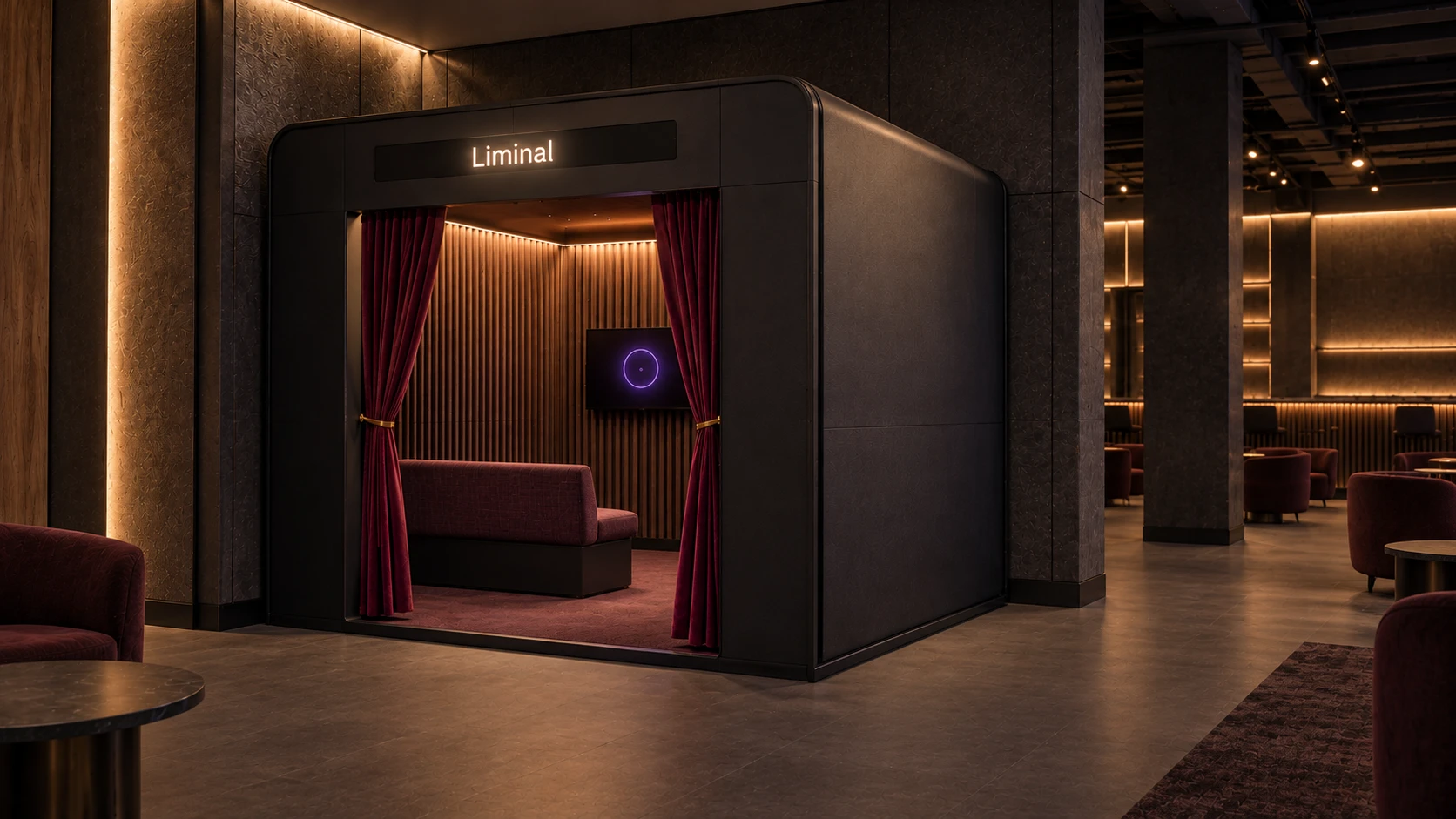
If people won't ask, the design can't rely on asking. So Liminal drops the request altogether. It's a private booth inside the venue that anyone can step into for a couple of minutes, with no staff member to approach and nothing to explain.
The idea is a small pause. You sit down, a question appears, you answer it out loud, and you leave with a short summary of the check-in. The pause sits in a place designed to stop people pausing, so it has to feel like your choice and not like someone stepping in.
Enclosed and unattended, so going in tells nobody anything.
Talking is easier than typing when you're impaired or overwhelmed.
No staff are involved unless you ask for them.
Reflections are combined and never attributed, which is what makes it safe to be honest.
This was physical prototyping: building the booth cheaply, at scale and then full size, so we could test the space on its own before any screen existed. A booth is a room before it's an interface, and whether someone feels safe enough to speak honestly comes down to the space, not the screen.
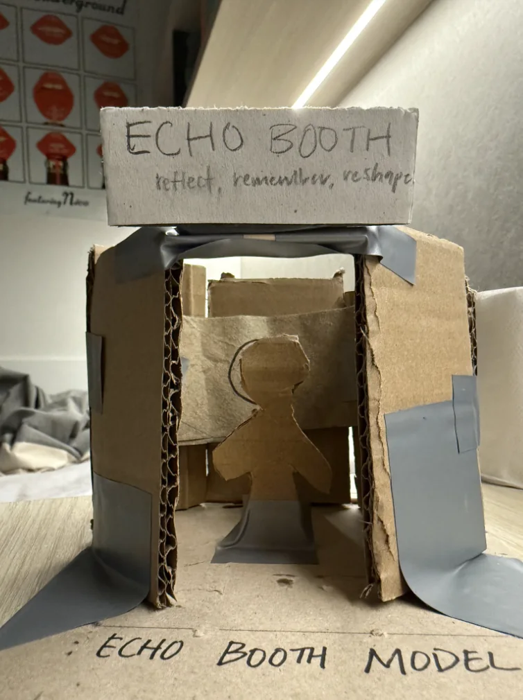
A scale model, used to argue about proportion and seating before we committed to a build.
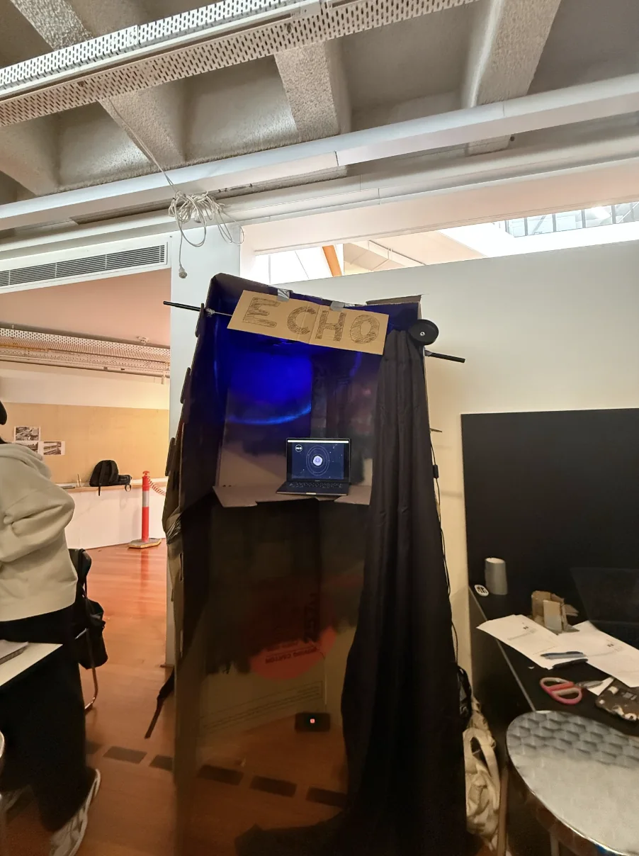
Full-size version: cardboard, a blackout curtain and a laptop standing in for the wall screen.
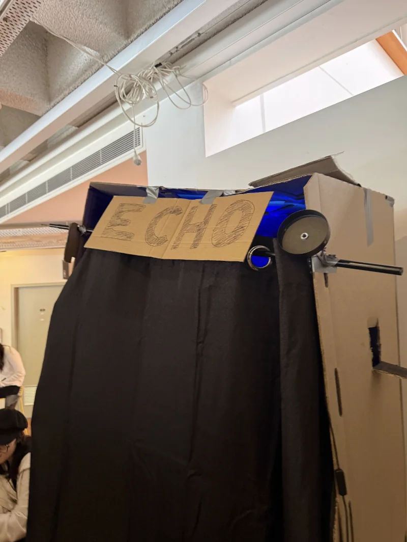
The entrance did the most work. It's a curtain and not a door, so going in doesn't commit you to anything.
We tested it in a room with the lights down and quiet music on, to feel something like a venue. Participants went in one at a time and talked through how private and comfortable it felt, and whether they'd use it instead of finding a staff member. The rough materials were fine for this. At that stage the question is whether the space works, and cardboard answers that as well as anything expensive would.
With the space tested in cardboard, I moved the booth into 3D. CAD and modelling tools such as Fusion 360 and Blender let me work out the enclosure, the sightlines and where someone sits in relation to the screen, then render how it would look under venue lighting.
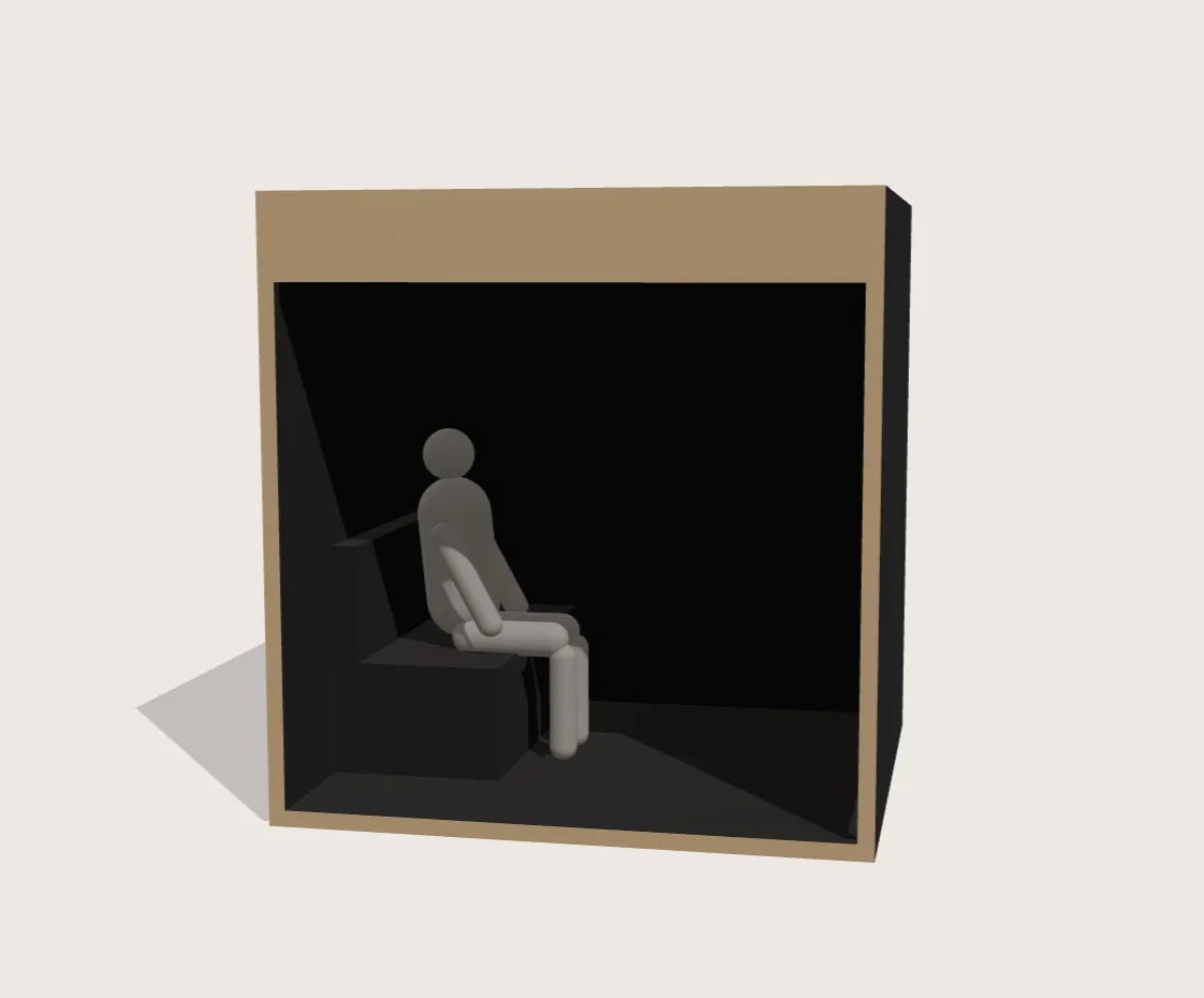
First pass: a plain block-out of the proportions and the seat, nothing else, so the shape could be judged on its own.
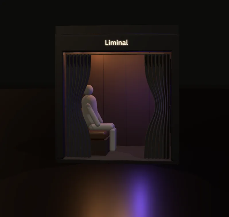
Second pass: curtain, signage and wall tone, tried under low coloured light to get closer to a real venue.
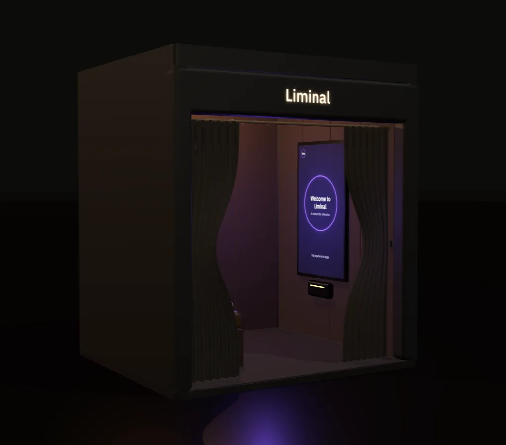
The screen went in last. Its glow shows a choice that testing later complicated. Colour was already doing a lot of the emotional work, and nobody had asked yet whether people could read it.
The model sorted out proportion and mood quickly, and gave me something to refine without rebuilding a mock-up each time a proportion felt off. With the space proven in cardboard and the shape settled in 3D, the interface could be designed for a room that already worked.
The interface is quiet on purpose. There's one thing on screen at a time, high contrast for low light, and slow movement instead of the alerts and progress bars that make people feel monitored.
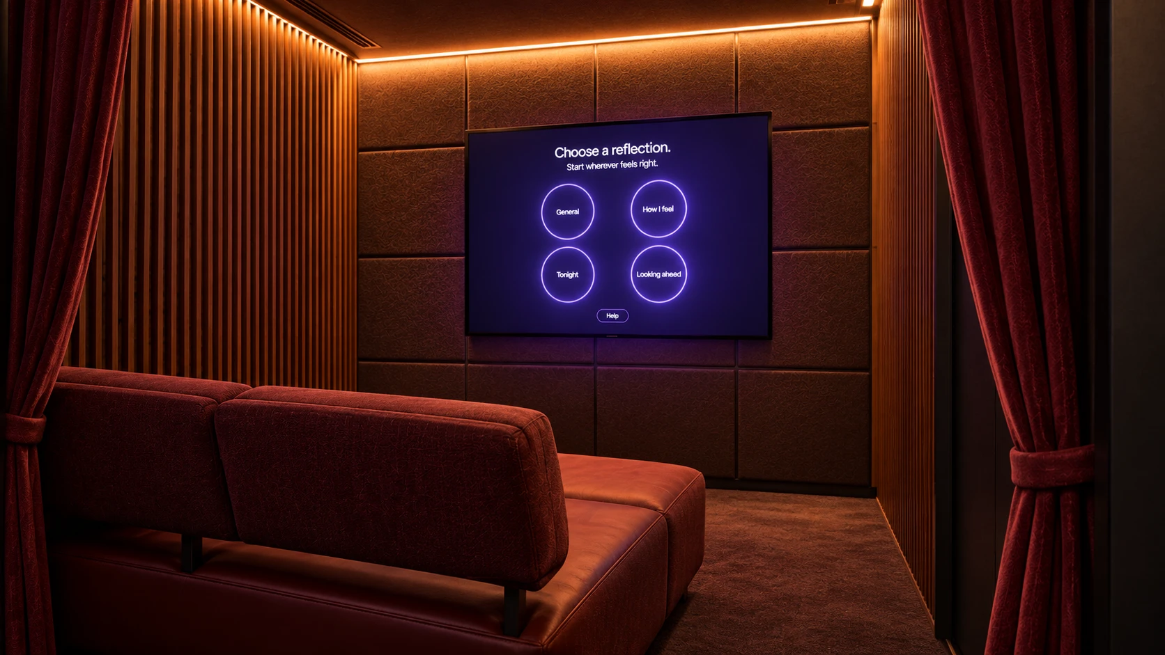
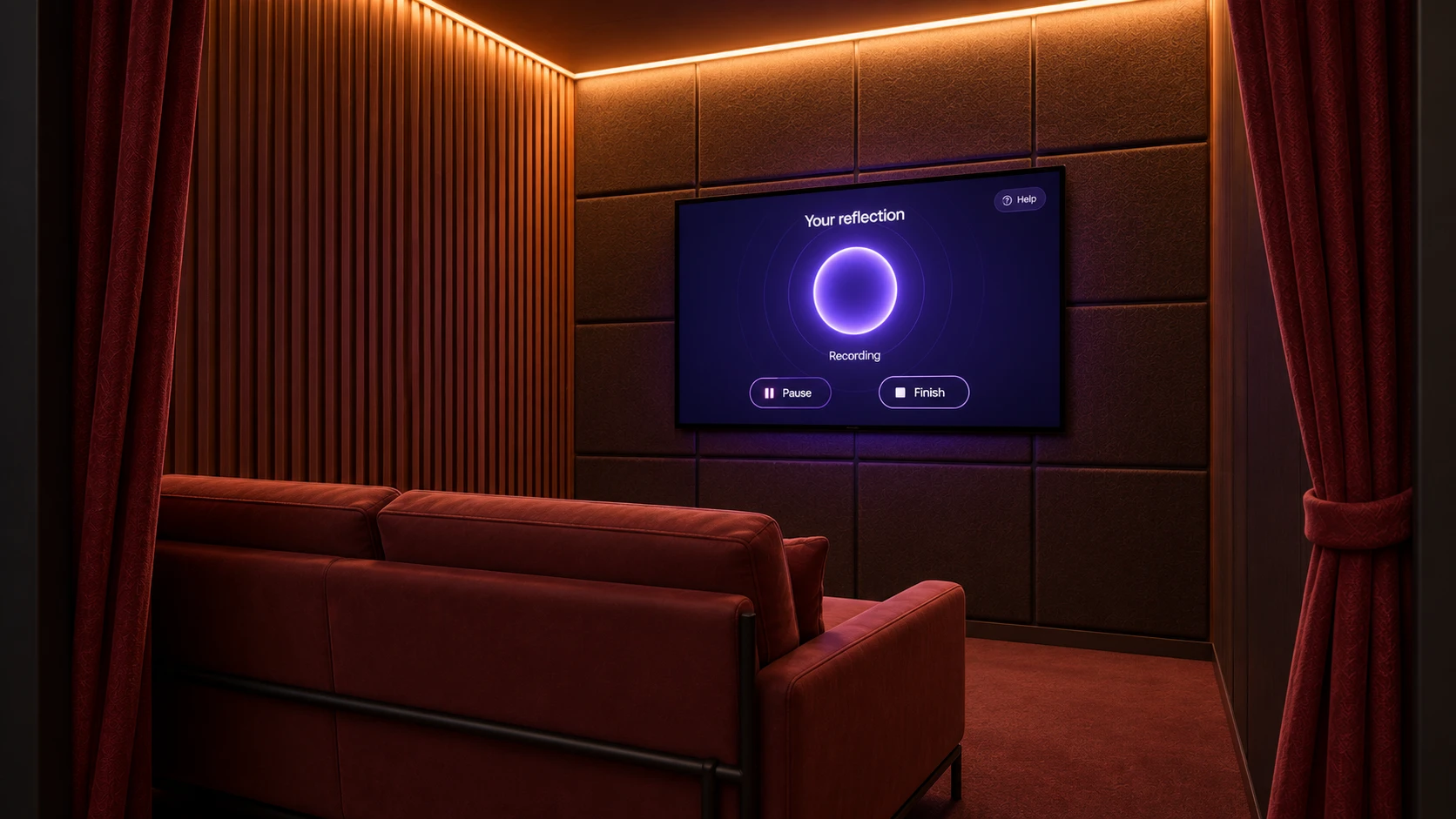
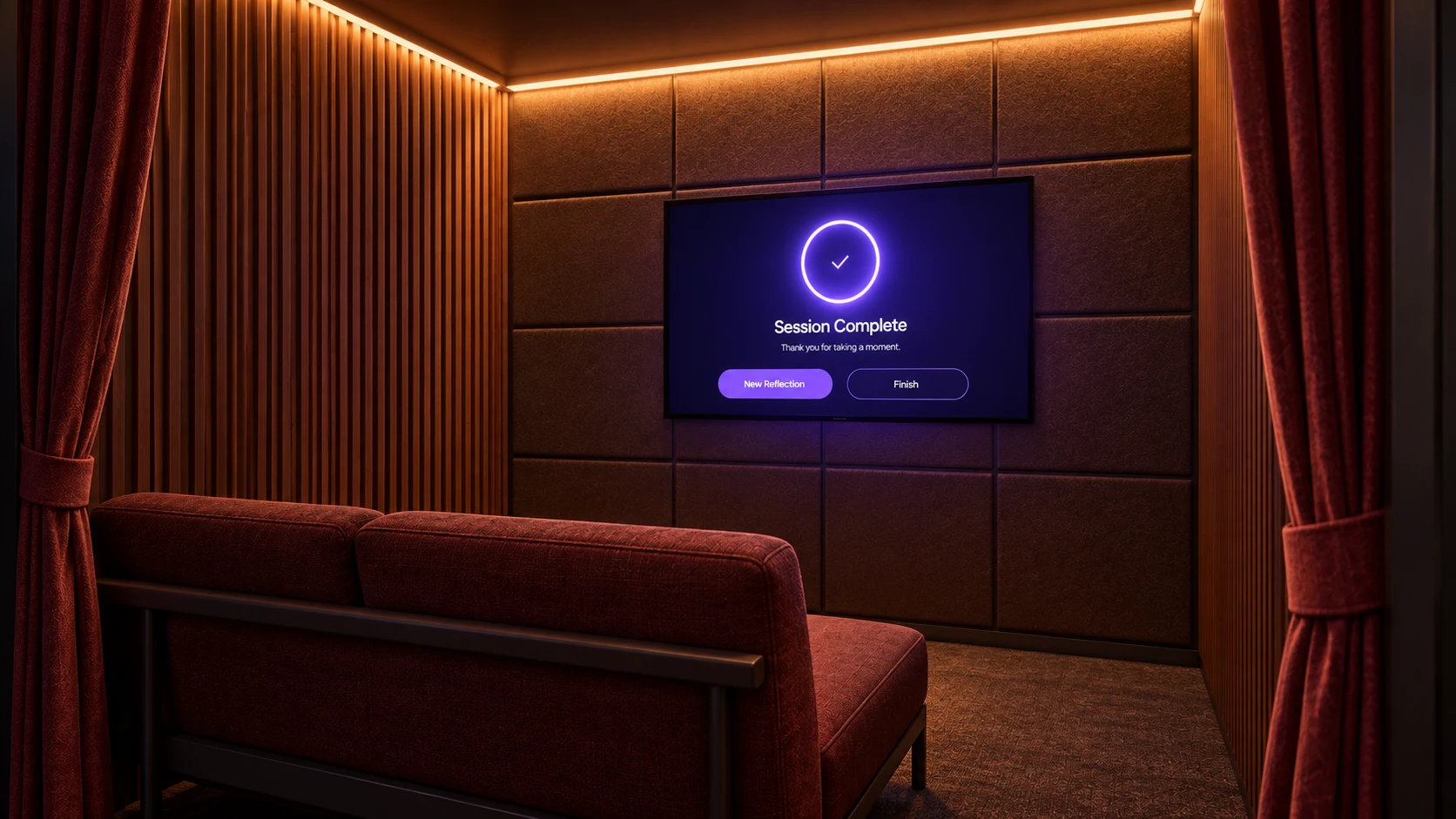
We tested with six participants aged 19 to 24 who go out between weekly and occasionally. They used an interactive Figma prototype and talked through what they were doing as they went (a think-aloud). Each session ran about fifteen minutes, in a dim room with some background noise so it felt closer to the place the booth has to work.
Participants went into the booth alone and told us how comfortable it felt, how private it felt, and whether they'd use it instead of going to staff. This part tested the idea behind the booth, not the product.
Think-aloud across the whole flow: welcome, choosing a prompt, recording, finishing, and the help and emergency options. We were watching for where people got stuck, not what they preferred.
One limit I should be clear about: voice recognition was never built. Participants spoke, then someone moved the screens on by hand. I chose that on purpose, because the question was whether the flow made sense and not whether transcription worked. It does mean the interaction was simulated and not actually working.
The interface changed colour with the person's emotional state. Participants noticed but couldn't tell what it meant. "I could tell it was reflecting something, but I didn't know what each color meant at first."
People reached the completion screen without knowing what they were leaving with. "The screen is clear about the session end, but it's not obvious what happens after I leave. Can you clarify what the 'artifact' is?"
This was the finding that mattered most, because it's the screen someone uses at their worst moment. "Visually distinguishing between urgent and non-urgent options would improve it even more."
The stillness I'd designed to feel calm read as an unfinished screen. "It's clear but feels a little minimal; maybe a small animation could make it feel more inviting."
Testing turned up eight usability issues. Four of them changed the design in ways you can see in the screens above.
Emotional colour with no key
An introductory cue explains the colours before the reflection starts: red for distress, blue for calm.
Session ended abruptly
A new reflection summary screen sits between recording and finishing, so the booth responds to what it heard before sending anyone back into the venue.
Help options indistinguishable
Colour-coded urgency: red for emergency and orange for staff help, so there's less to decide when someone is most stressed.
Stillness mistaken for an empty screen
Ambient motion: slow pulses and background gradients that hold attention without getting stimulating.
The summary screen is the change I'd defend the most. Nothing in the brief asked for it and no participant asked for it by name. It came from noticing that everyone described the ending the same way, as a stop and not a close. The whole idea of the booth is care, so an interface that listens and then just switches off goes against that.
Most interfaces are built for someone who wants to finish something. This one had to work for someone who's actively avoiding being seen needing help, and that flips almost everything I'd normally think of as good design.
Normally clarity means making the next step obvious. Here it meant making the whole thing feel optional. Normally feedback confirms progress. Here it meant never making anyone feel assessed. I spent more of this project taking things out than adding them, and the moments that tested best were the quietest ones.
The other thing I learned is that the space matters more than the screen. Whether someone would speak honestly was decided by the curtain, the seat and the light before a screen ever loaded. That's why the cardboard came before the pixels, and I've kept working that way since.
Voice input was simulated and not built. Participants were sober, in a room made to feel like a venue. The booth visuals are AI-assisted renders, not a real built object. The evidence supports the design decisions, not a finished product.
The real test is a working booth in a real venue on a real night, and whether anyone walks in. So far the design makes sense to people who were asked to imagine needing it. That's a good place to be, but it isn't done.
Project 03 / 06
Product design · UI design · Systems design · University project
A laser light and indicator remote for the back of a bike, with a navigation app that plans routes around safety. We made it to help more people ride every day in Sydney.
Lanes in Sydney disappear without warning and upgrades are slow, so a lot of people decide not to ride at all. We couldn't change the roads.
“I'd never choose to ride on the quieter parallel streets at night, it just doesn't feel safe.”Rider we interviewed
So we asked what we could change about the experience of riding on the roads that already exist.
A device that makes you visible, an app that helps you plan, and a community layer so riding feels less lonely.
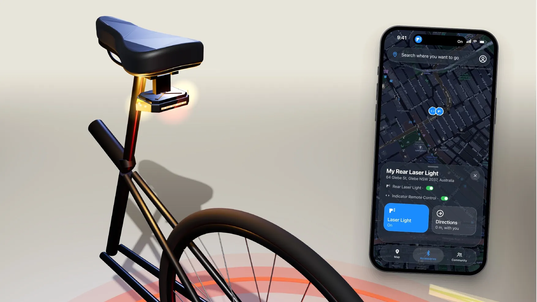
A laser outline projected onto the road, a bright rear light and a handlebar remote. The indicator pulses about three seconds before a turn, so your eyes stay off the screen.
Routes weighted by bike lane and car-free share as well as time, hazard warnings along the way, device status and Find My Bike.
Nearby groups are found for you and you join in one tap, with monthly challenges and medals. We treated seeing other riders as a safety feature.
The three parts work as a loop: ride, report what you find, feed safer routes back to everyone else, gain confidence, ride again.
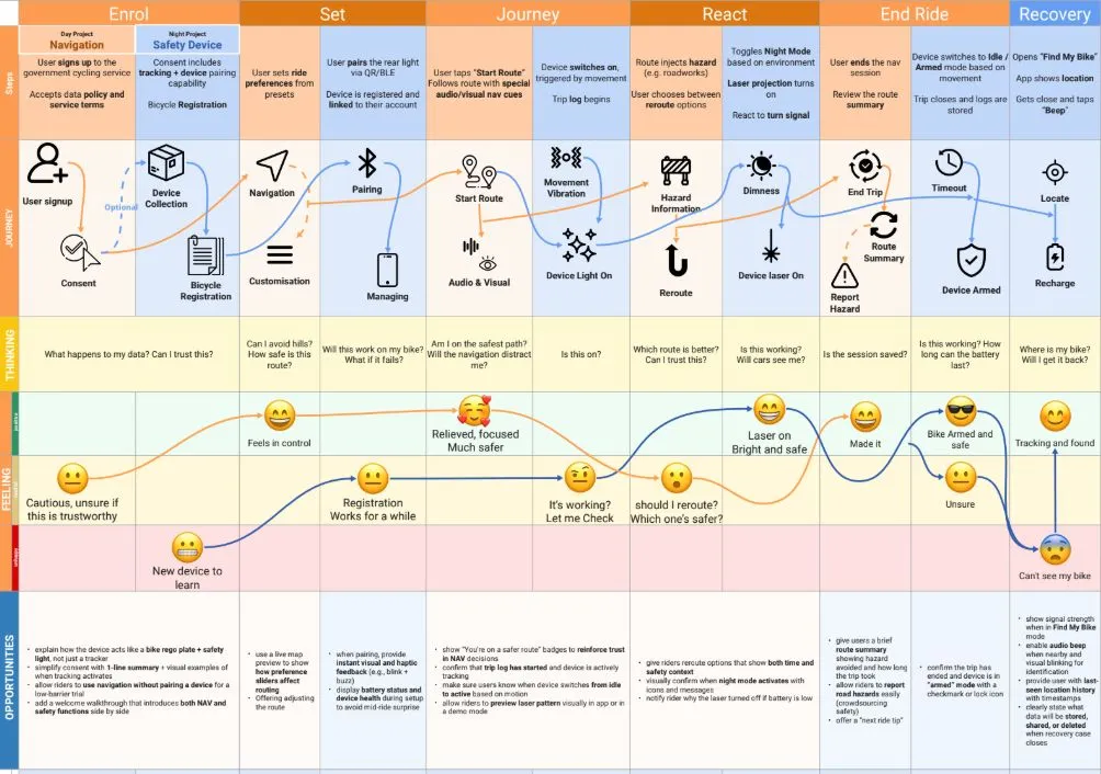
Mapping the rider, the app and the device across a whole ride showed how much depends on the handover between hardware and software.
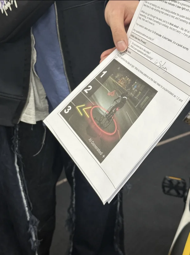
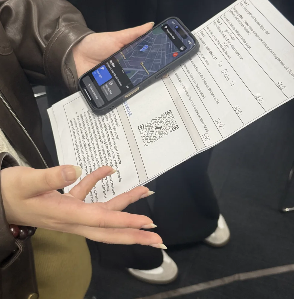
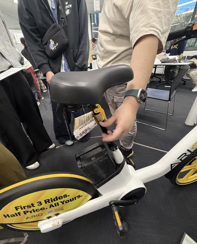
We ran think-aloud sessions at a live testing fair with the app on a phone and the laser device fitted to a real bike.
We marked the laser outline on the floor as a 1.5 metre circle, so people could stand inside the space the light claims.
Usable, and short of good. The gap is where the redesign went.
Hazard reporting and Find My Bike were both completed.
SEQ for hazard reporting, 6.4 for Find My Bike, out of 7.
Each traced to a screen and fixed in the next version.
Hazard reporting and Find My Bike both finished at full success with high ease ratings. People recognised the red flag and finished quickly.
The map felt too restricted, route-edit instructions were missed, and it wasn't clear which controls were on the hardware and which were in the app. The laser patterns didn't read as meaning anything, and labels like “fast” and “easy” told people nothing.
Three screens redesigned, each from something a participant said.
“What's the difference between fast and easy?”
Four coloured buttons became a tab bar, with a line explaining each route and four numbers: bike lane share, car-free share, distance and time, with elevation underneath.
Three fixed options, and none of them was the right one.
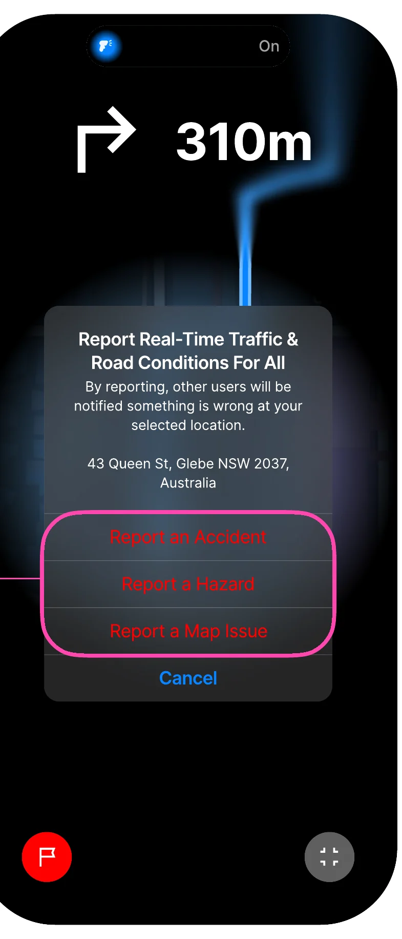
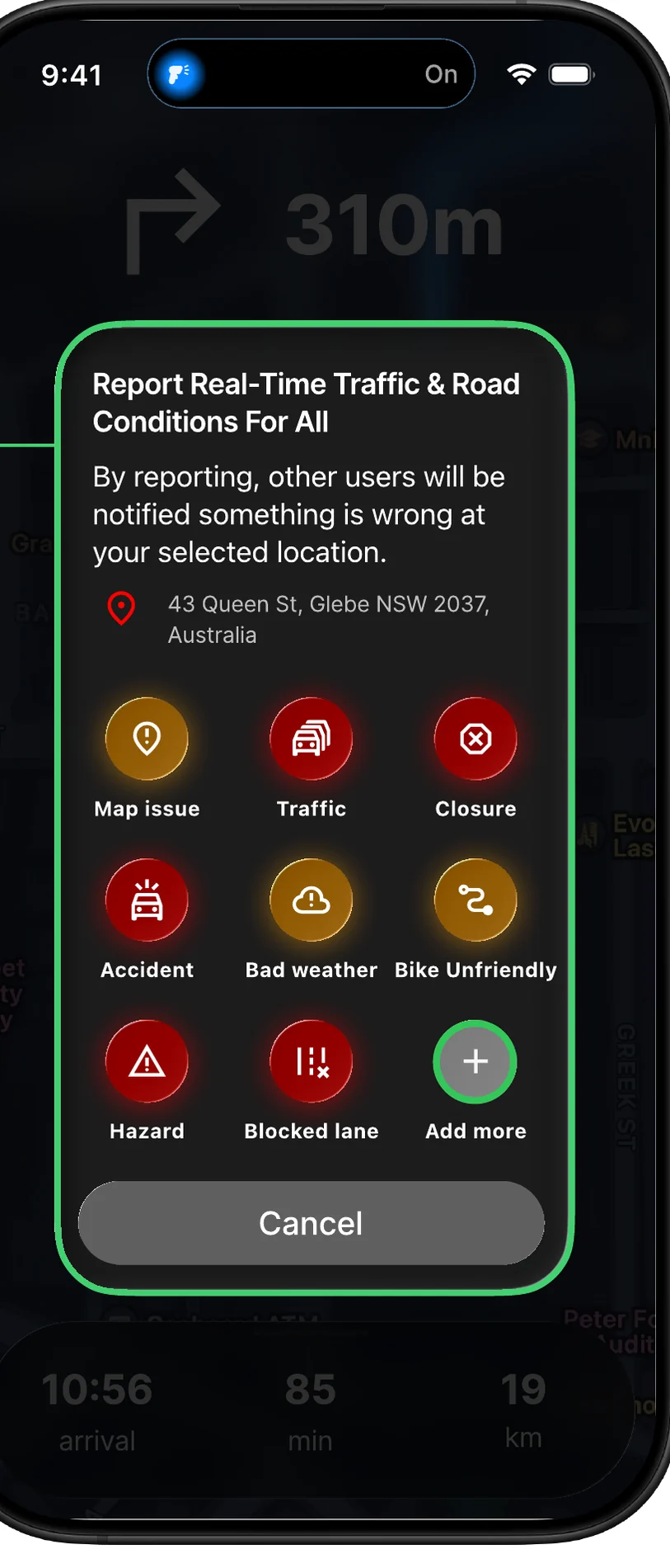
A grid of nine tappable types for one-tap reporting mid-ride, with free text for anything the presets miss.
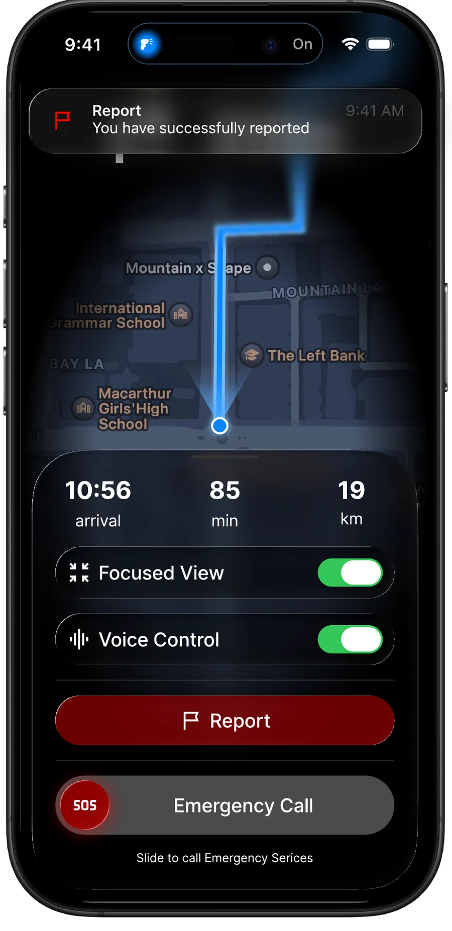
“I am not sure whether the accident is successfully submitted.”
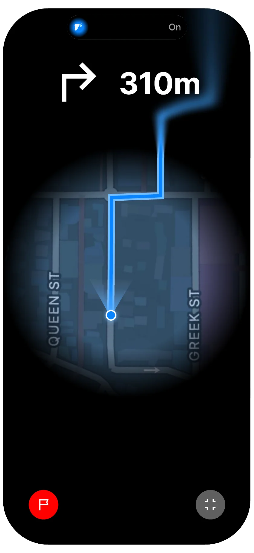
A confirmation banner after reporting, voice guidance, a focused-view toggle for the map and an SOS slider.
These changes came out of testing but haven't been tested themselves. The SUS score belongs to the version that went into the session.
A six-week pilot with two bike shops and around thirty riders, tracking join rate, challenge completion and theft recovery.
Beyond that: bike registration through BikeID, building the device in with manufacturers, and opening the hazard data to councils so the reports reach the people who decide on infrastructure.
Project 05 / 06
UI design · Interaction design · University project
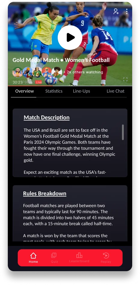
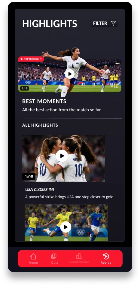
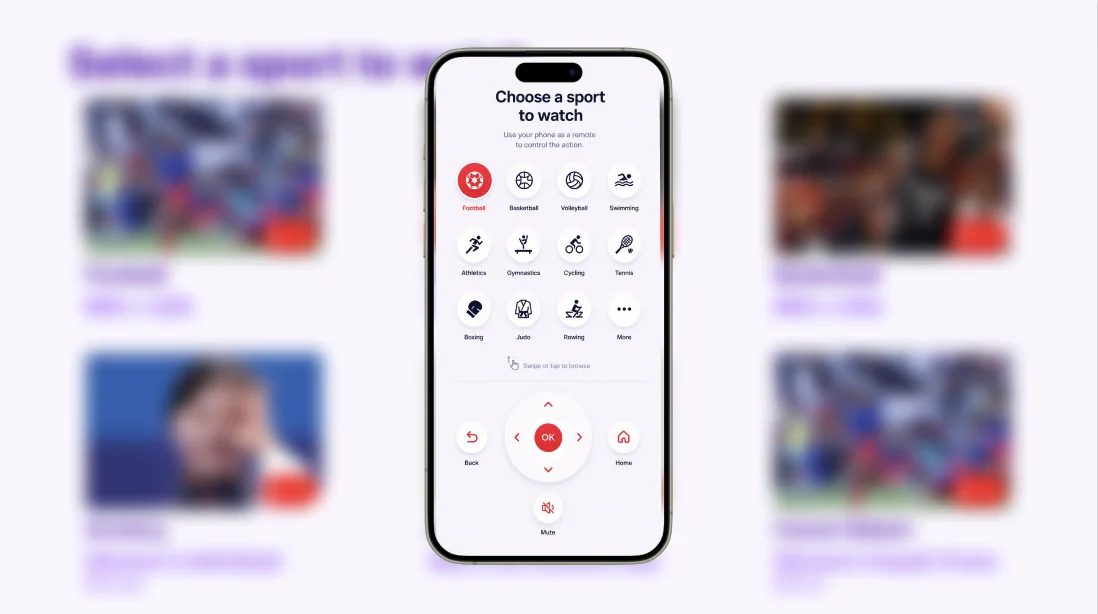
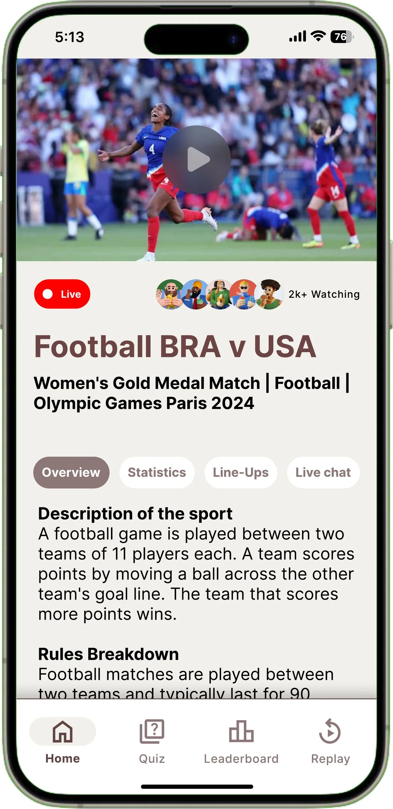
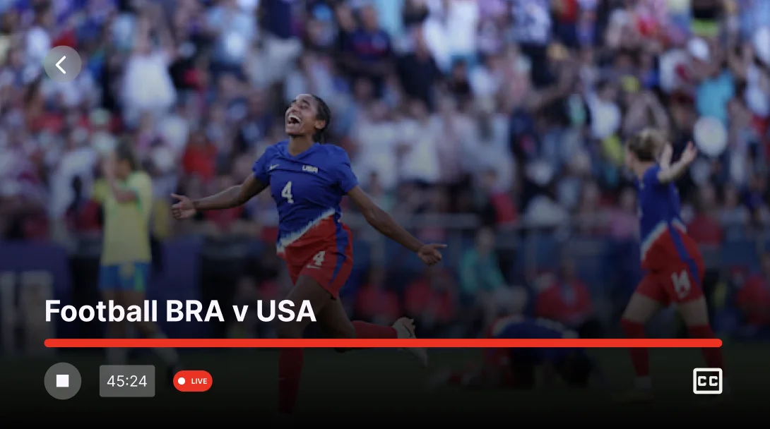
An educational second-screen app that helps anyone follow an Olympics broadcast, and a remote app that connects the phone to the TV, whatever their age.
Card sorting and think-aloud testing with five people: three children aged 8 to 12 and two parents.
Viewers of every age struggle to follow the rules and scoring of sports they don't know, and a live broadcast gives them no way in.Priority insight
The card sort split cleanly by age. Both groups made sensible structures, then disagreed about the same two features. That disagreement decided the information architecture.
Two of the three children created a discard pile. Parent controls and notifications went straight into it.
Both parents put those same two features at the top of their hierarchy, under headings about control and priority.
Three rules, written before any screen was drawn.
Nothing fully replaces what the viewer came to watch. The broadcast stays on screen, or visible behind whatever sits on top of it.
Explanations arrive next to the play they relate to, not in a help section nobody opens.
Progress comes from noticing what happened in the match, so the loop points back at the broadcast.
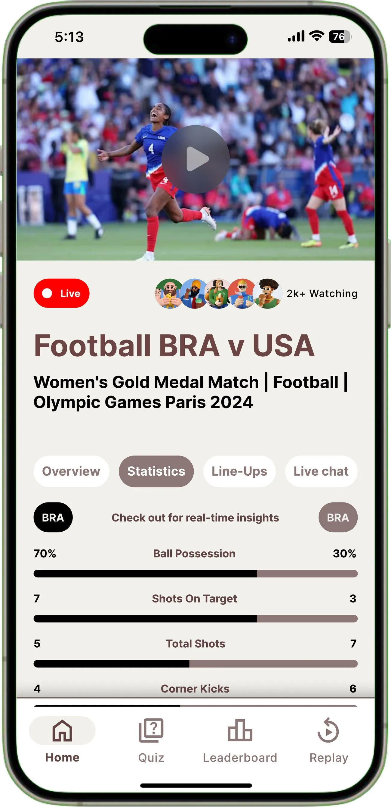
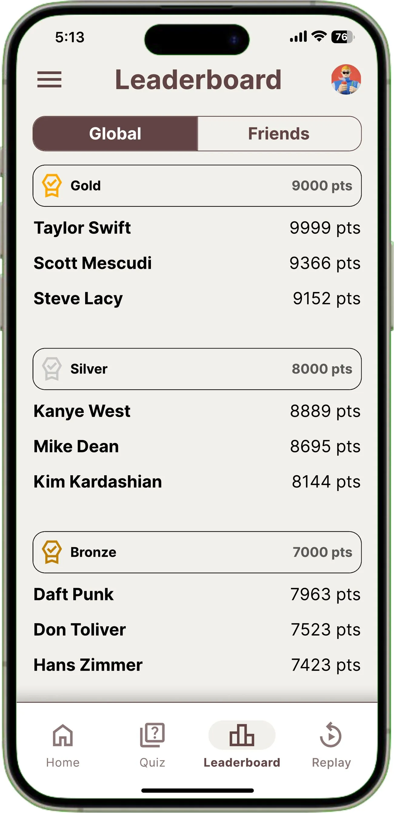
Four modes in a fixed bar: watch, play, compete, catch up.
The broadcast holds its position and the content around it changes underneath, so curiosity never costs you a goal.
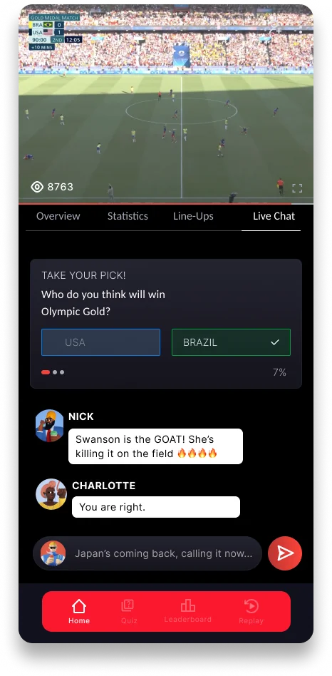
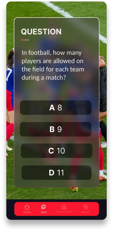
A question is a moment inside the broadcast, so answering feels like playing along and not being marked.
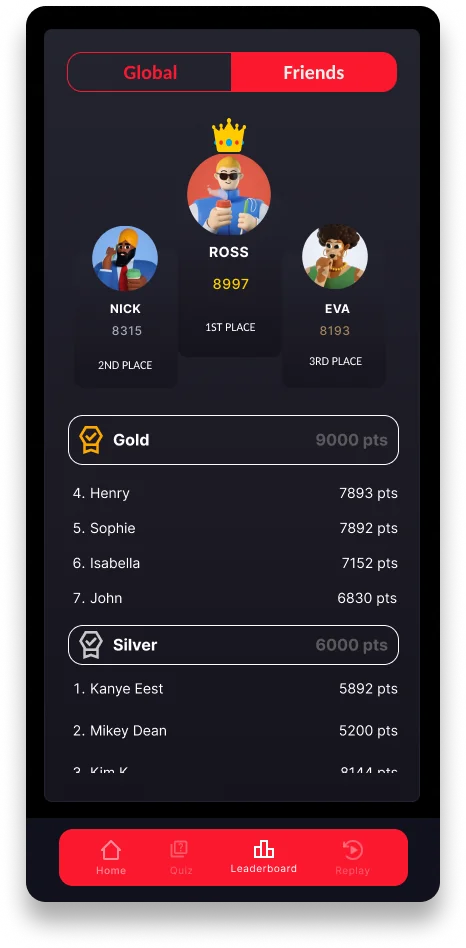
Standing is shown in bands, so there is always a visible next step and a casual viewer is not racing the most committed one.
Taking a side costs one tap and gives something back straight away. Conversation sits behind that for anyone who wants it.
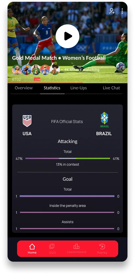
A non-expert mostly needs to know who is ahead and by how much. The detail sits quietly underneath.
Arriving halfway through is normal, so catching up is a short route back to the present.
The same phone drives the television, so choosing what to watch happens on the device already in your hand.
The choice people actually make is which sport, so that leads, and directional control sits underneath for anyone who wants to steer the TV directly.
The structure held. Almost every screen inside it was rebuilt as testing showed where attention was going.
Everything weighted equally.
Match context now gets room to be read.
Accurate, but dense to read.
Who is ahead is answered first.
One long ranked list.
Banded, so progress stays in reach.
Ten task scenarios across phone and TV, each with success criteria set before the session.
Children aged 8 to 12, and parents.
Across phone and television.
19 of 20 sections reached.
Overlay located from memory.
Overlay recall accuracy
Placing the TV overlay from memory, five minutes on.
Time to reach the leaderboard
Against a 10 second criterion. The two who missed it were children.
“Reels” meant nothing to a ten year old
Renamed to Replay, with a clearer active state after misclicks on neighbouring tabs.
The quiz let you retry until correct
Locked to a single attempt, after a child said retries ruined competing with friends.
A parent could not see what their child posted
Added a comment safety control, a need only the parent sessions surfaced.
The TV overlay was missed or misremembered
Overlay enlarged and anchored with a high-contrast marker.
This round tested mid-fidelity screens, so the build above carries the changes but hasn't been back through a session.
A question over the live match, one attempt, and a score that turns into where you stand.
The broadcast stays visible behind the question, blurred and not dimmed, so its colour and motion still register in your peripheral vision. Answering feels like playing along and not like being taken somewhere else.
The answer locks immediately. Getting it wrong still teaches you something, which is the point. We removed retries because a child in testing said they ruined competing with friends.
Your score is measured against a tier and not a rank. When you finish you can see exactly how far off Silver you are, which a flat leaderboard can never tell a casual player.
Pick an answer to start
Project 06 / 06
UX research · Co-design · University project
Pin is a campus map where something broken gets a pin, other people add to it instead of repeating it, and the university has to reply with a status that moves or explains itself. Four students named it and defined it. My part was the two-stage co-design programme that got us there, which meant designing the research tools and not the product.
How can digital platform design improve dignity and comfort in everyday life? That was the question. The catch was that we weren't allowed to start with an answer, a problem statement or a list of features to validate.
Every other project in this portfolio starts with me deciding something and testing whether I was right. This one was the opposite. The participants defined the problem, and my job was to set things up so they could do that honestly.
That makes the kit the interface. A card with five ruled fields asks a different question from a blank page. A pre-printed category is a decision already made. A colour with a stated meaning turns a sticky note into a vote. Each of those is an interaction design choice, and each one either invites something true or nudges someone towards the answer I already had in mind.
We ran a two-hour pop-up in the Wilkinson Building lobby instead of recruiting people into a room. Nobody had come to help us. They were walking to class, so the whole activity had to work in about five minutes at a stall they happened to pass.
Recruited entirely from foot traffic, with no screening and no reward beyond a bowl of lollies.
Notes and cards left on the boards, each one written and placed by the participant.
Every response pinned to the exact place on the map it was about, not a general category.
The hard constraint. It set the format of every card, prompt and voting mechanic on the table.
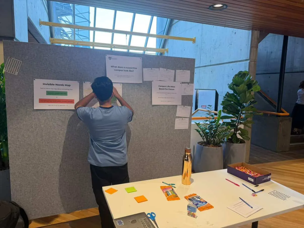
Participants pinned their own notes. We did not transcribe for them, which kept their wording intact.
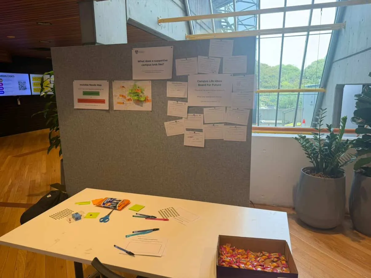
The stall in the lobby. Boards at eye level, materials at arm's reach, nothing needing explanation.
Green for a place that supports you, orange for a place that needs improvement, pinned to the exact spot on a campus map. Because people had to place the note, every complaint was tied to a location we could go back to.
One open prompt: imagine a future campus that better supports people's everyday needs, and what would it include. Written or drawn, then pinned up for the next person to read.
Anyone could read what others had left and star what they agreed with. It gave people with thirty seconds a real way to contribute, and it turned a wall of individual complaints into a rough measure of what was shared.
The star sticker was the most useful thing on the table. It cost a passer-by nothing, so people who would never have filled in a card still left a signal. It's the reason we could tell one person's bad day from a problem twenty people recognised.
Forty-two responses across sixteen locations, coded into seven themes through affinity diagramming. The stacked pins are where several people independently named the same building.
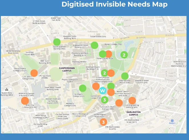
Green marks a place that supports people, orange a place that needs improvement. Numbered pins are stacked responses for the same building.
Supported by people, let down by placePeople described support in terms of other people: warmth, community, staff who helped. What needed improving was almost always physical: broken lifts, seating, food, bins. The campus was valued for how it felt, but it fell short on the basics that let students stay.
Services exist, but the system doesn'tThe wellbeing centre, the career hub and learning support were each praised on their own, and none were described as connected. The most detailed responses asked for networked care linking academic, legal, financial and health support.
Small needs, shared by manyThe highest-starred notes were working lifts, affordable food, bins and sheltered seating. These are things people put up with daily and don't escalate. Star voting gave a wider group an easy way to confirm the same everyday concerns.
We now knew where things broke and roughly how many people agreed. We didn't know what anyone actually did next.
A pin on a map is a category. It doesn't tell you whether the student reported it, worked around it, paid to fix it themselves, or quietly stopped going to that building. That gap is the whole design question, because a platform that only makes problems visible is no use if people don't report them for some other reason.
So the second stage traded reach for depth: four students, sixty minutes, seated, with a kit built to capture what happens between noticing a problem and living with it.
The centrepiece is an A3 sheet I'd happily call a screen if it had pixels on it. One card in the middle holds a real situation, four zones sit around it, and a colour system lets three other people annotate your experience without a facilitator interpreting anything.
The moment of recognition, separated out so it is not collapsed into the complaint.
The support that was reached for, whether or not it worked.
One specific situation on a card: where, what happened, why it mattered, what you did first.
The most valuable zone. Avoidance is a decision, and it rarely gets written down anywhere.
The work students absorb. This is where the cost of the problem actually shows up.
Four zones, not a sequence. Participants build their own sheet, rotate to everyone else's, then come back to their own to vote.
Five materials with five stated meanings, explained once at the start. After that the sheet reads itself, and the analysis doesn't depend on anyone remembering who said what.
Pink is the one I'd defend the most. Giving disagreement its own colour meant a participant could contradict someone without arguing with them, and it stopped the loudest person in the room setting the group's position. Every pink note is a finding we'd otherwise have lost to politeness.
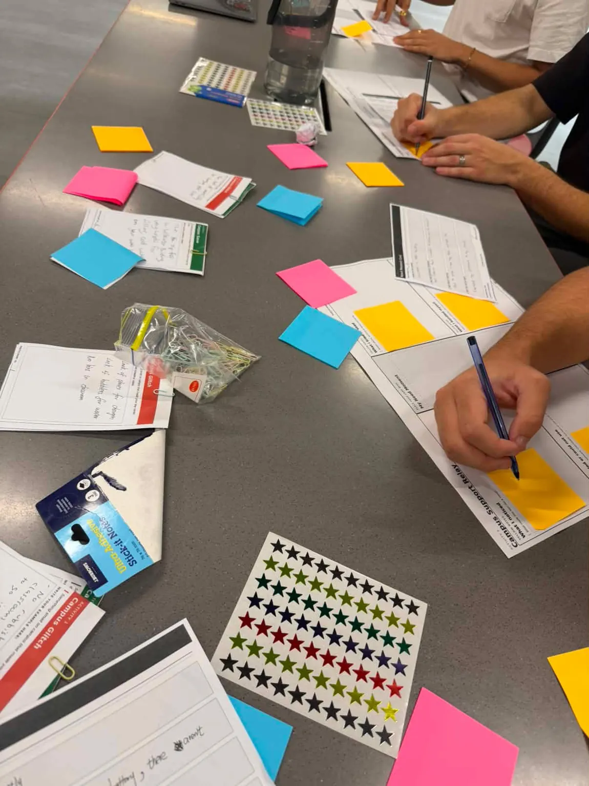
The kit in play. Everything on the table has a stated meaning before anyone writes anything.
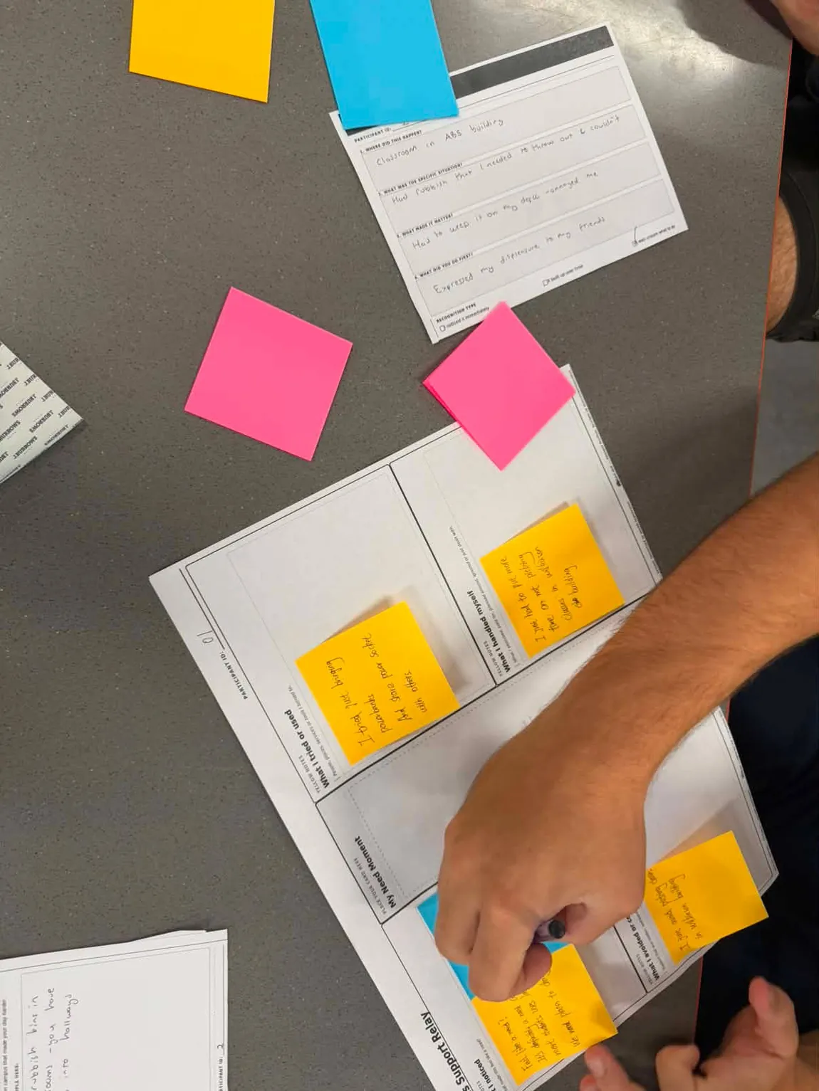
A sheet part way through, with the need moment card that anchors it sitting above.
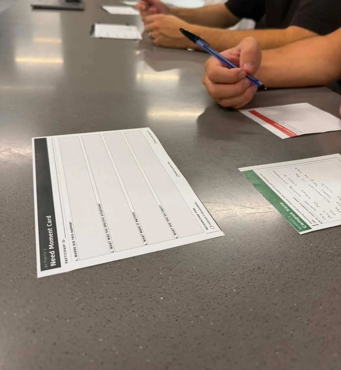
The start of a session. Five ruled fields and a coloured band, and nothing else on the table yet.
We piloted the kit before running it. Almost every change was the same correction: something I'd designed was quietly answering the question for the participant. These are the ones worth showing.
An open warm-up discussion about campus needs
Too broad. People gave general opinions about the university and not anything that had actually happened to them.
Two card types: Campus Glitch and Campus Save
One small thing that made your day harder, one that helped. Concrete, under a minute, and it gets the good alongside the bad so the session isn't just a complaints box.
"Write about two real campus moments"
Too vague to analyse. It never said what counted as a moment, so responses ranged from a specific Tuesday to a general feeling about first year.
A Need Moment Card with five fixed fields
Where, what happened, why it mattered, what you did first, and how you recognised it. The fields do the facilitating, so a quieter participant gives the same quality of evidence as a talkative one.
A linear support journey map
Too linear and far too service-design shaped. It assumed students move neatly from need to support, and a template like that only ever gives back the answer it implies.
The four-zone relay sheet
A station and not a sequence. It holds people, places, services and self-management side by side, and it made room for the finding that mattered most: avoiding support is a decision, not a gap.
A support quality sort with seven descriptors
Overloaded. Visible, accessible, connected, dignified, comfortable, useful and appropriate are my words, and sorting them only tells me what participants think of my vocabulary.
Three sentence stems on a card
Support is worth using when. Support fails when. Support should never. Participants write the principle in their own language, and none of the three can be answered with a feature request.
Pre-written touchpoint tiles for the ideation session
The tiles assumed the shape of the answer. A table with "notification", "map" and "status" printed on it will produce a reporting app every single time, and we'd have called that a finding.
Blank slips and a facilitator-only prompt sheet
Participants name the steps. The prompts stay with the facilitator so they can unstick a group without putting options on the table. Feature stickers went the same way, because they invite decorating and not designing.
A formal observer sheet and a transcript-based analysis
It didn't match what we actually captured. We had photographs and kept sheets, not recordings. Leaving the plan in the appendix would have suggested a body of data that didn't exist.
Face-free photography and retained artefacts, and we said so
This is the change I'm most willing to defend. The easiest thing in the world is to describe the method you intended. We rewrote the plan to describe the evidence we actually held, and the analysis is more honest for it.
Every note, card and slip was transcribed as written, then coded in three passes: clusters first, then patterns across clusters, then the insight underneath.
"I just paid 40 dollars and got one that fits the charging ports."
On solving an incompatible charging port alone. Two peers starred it, one adding that the cost of living crisis even manifests in the university.
"I just avoided picking classes in Wilkinson building."
The clearest version of avoidance as a strategy. Not a complaint about a building, but a change to a degree.
"You miss one hundred percent of the shots that you did not take."
Left by a peer, on a note that said "I did not ask the tutors". It drew three red dots, which is the sheet disagreeing with itself in public.
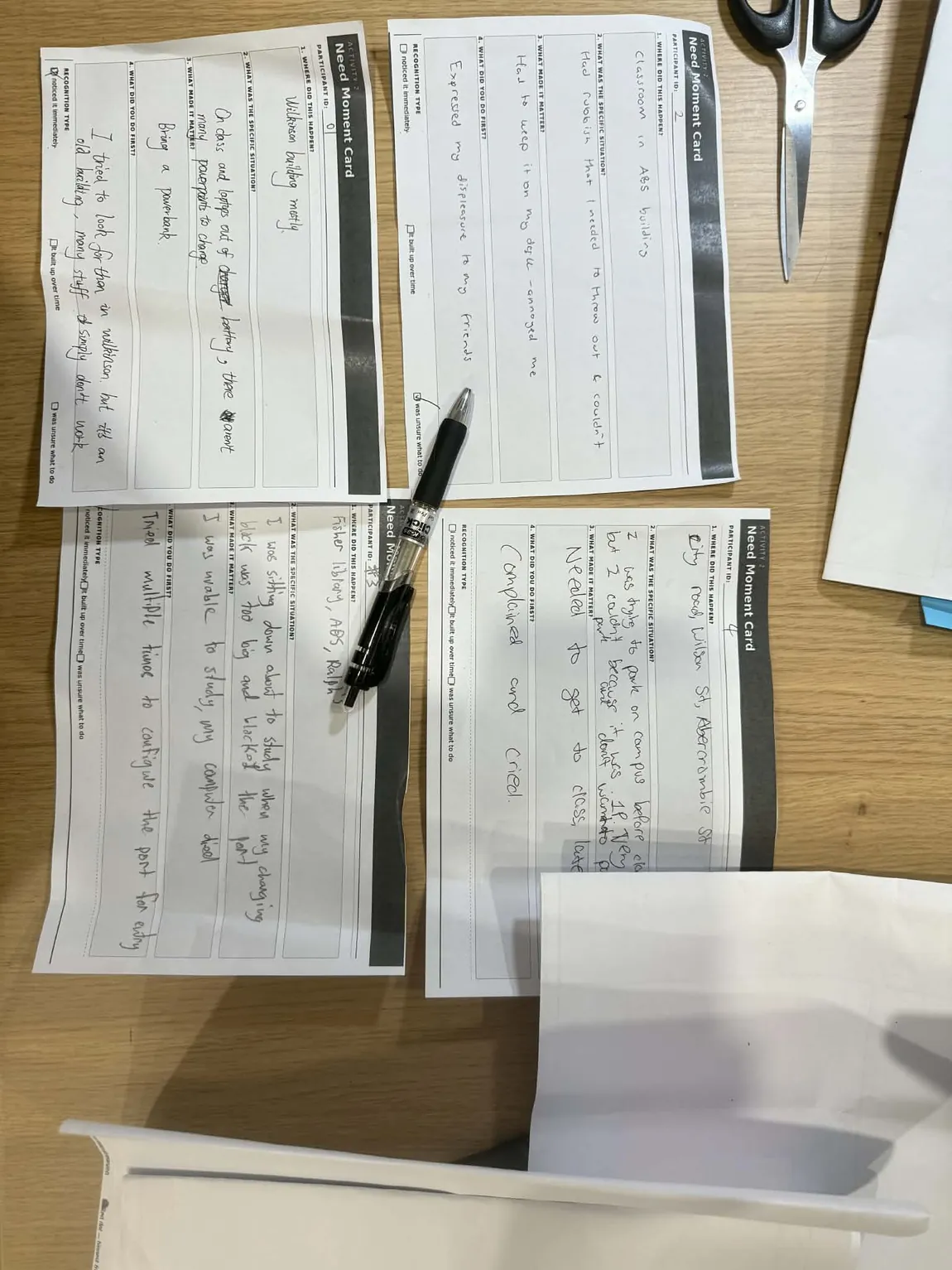
Need Moment Cards. The fields are why four different people produced comparable evidence.
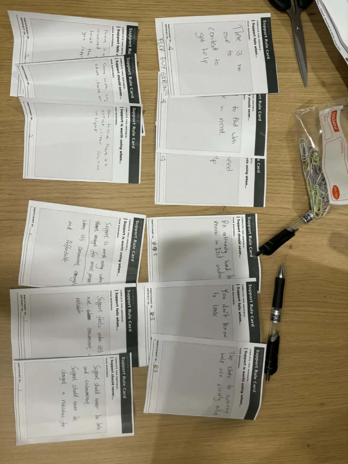
Support Rule Cards. Design principles written in participants' own words, not ours.
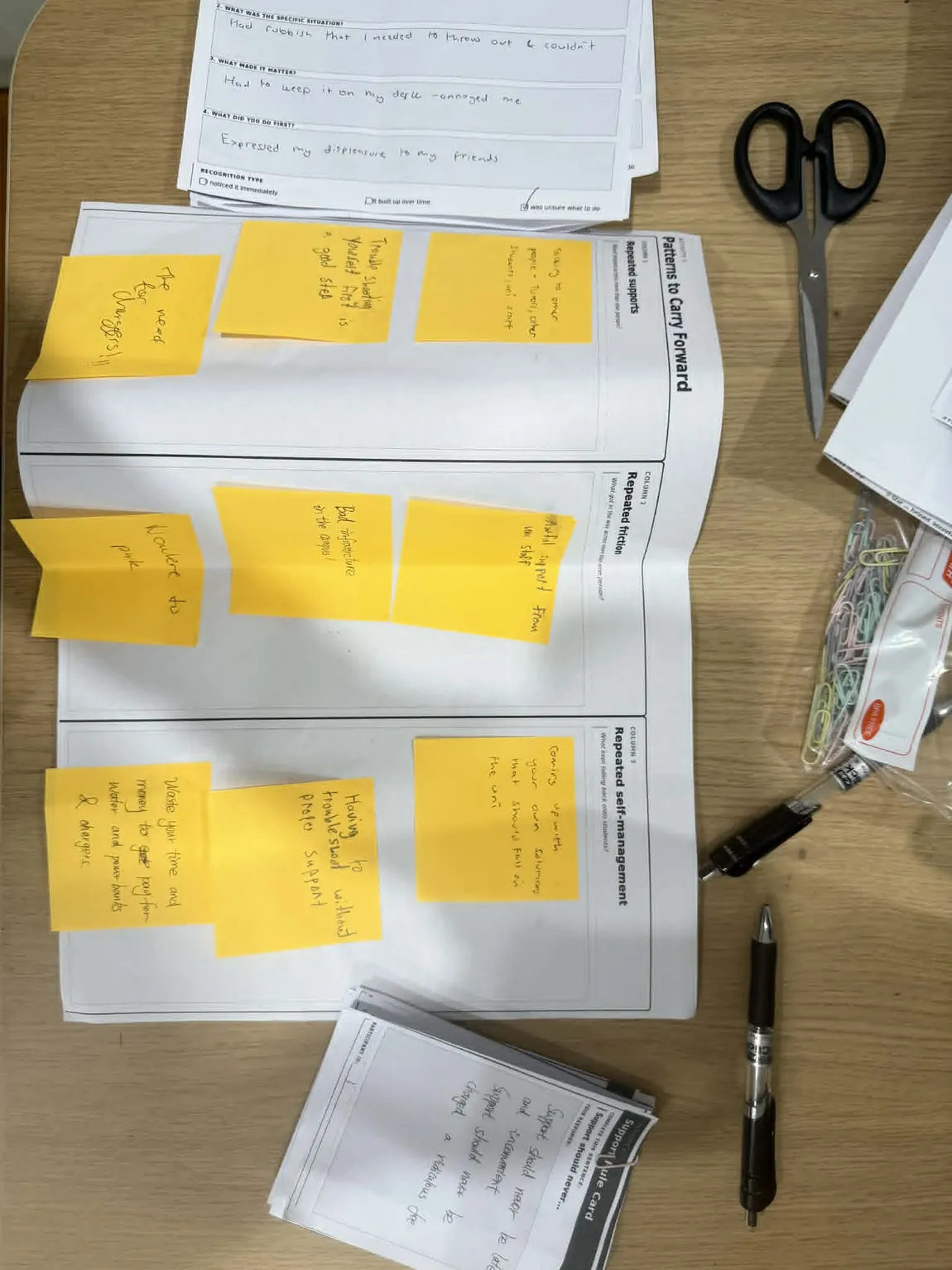
The closing Pattern Wall, built by the group in the last five minutes as a visible handover.
Every participant had a workaround, and not one had reported the problem. It wasn't laziness, and it wasn't that they didn't know about the services. It was a sensible read of a system that hadn't moved the last time they used it. That only showed up because "what I avoided" had a zone of its own, next to "what I tried", where a participant had to fill in both.
The last session brought the same four participants back to turn the evidence into a direction. Seven activities in seven sealed envelopes, opened one at a time, so nothing sitting on the table could hint at what was coming.
One rule governed the whole kit: leave it blank wherever the participant should be deciding. Cluster names weren't pre-printed, because printing a category is choosing it. Risk cards became blank slips, because risks a designer writes are the designer's risks. The phone-shaped prototype templates were replaced with frames that could hold a screen, a message, a map, a status or a service moment, because the brief said platform, experience or service and only one of those is an app.
The facilitation script worked the same way, right down to a list of things not to say:
It paid off in the first ten minutes. We handed over a card saying trust is the barrier to support uptake, which was our reading of the evidence and the one we were most attached to. A participant put a red dot straight on it: trust is fine when things actually move, the problem is that nothing happens, so calling it a trust problem is wrong.
Response, not trust. That correction reshaped the rest of the session, and it only happened because the card was made to be argued with and not agreed with.
What the group settled on, and named in the room, was Pin. It's a campus map where you drop a pin on something broken, add to someone else's pin instead of writing a duplicate, and the university has to attach a status that either moves forward or explains why it won't. The rules around it are theirs, not ours: a separate, more private track for accessibility needs, a free fallback so a tip never costs money to act on, and a hard cap on how much anyone has to write. Nothing was built, and none of it was meant to be. The deliverable was the evidence and the direction it pointed, which is what a co-design programme is supposed to produce.
That a research tool is a designed object, and it behaves just like an interface: it has defaults, it has affordances, and whatever it makes easy is what you get back.
My instinct is to turn up with an answer. Most of my other work rewards that. Here it was the thing that went wrong, and I could watch it happen in the pilot: every version of the kit that felt more designed was a version that had decided more on the participant's behalf. Holding back turned out to be the harder skill, and leaving things blank the more expensive one.
I should be clear about the limits too. Four participants across both workshops gives depth and not coverage, and using the same four people twice means we got continuity but a narrower view. The pop-up reached twenty, but in five-minute slices. Those are real limits on what any of this can claim, and they belong in the write-up and not in a footnote.
What I'm taking into the next project is smaller and more practical. Give disagreement its own colour. Make the cheapest way to take part a real one. Write down the plan you actually followed, not the one you meant to. And when a participant tells you your framing is wrong, the session is working, not failing.